
Box Plots
The conventions describe here applies to any box plot in the BQN GUI (in subscriber QoE, subscriber dashboard, subscriber groups page, subscriber group dashboard, system application speeds, system application latencies, etc.).
A box plot is a summary of the distribution of a set of values. It shows the maximum and minimum values and what we call percentiles. A percentile is a value that is equal or bigger than a given percentage of the value set. For example, a 50% percentile is the value separating the lower half and higher half of the value set and it is also known as the median. A 10% percentile has 10% of the value set below it, and so on. Our box plots provide the percentiles 10, 25, 50, 75, and 90%.
For example, in a box plot of speeds, a 25 percentile of 30,4 Mbps indicates that 25% of registered speeds are lower than 30,4 Mbps (and therefore 75% are bigger).
The next figure shows all this graphically:
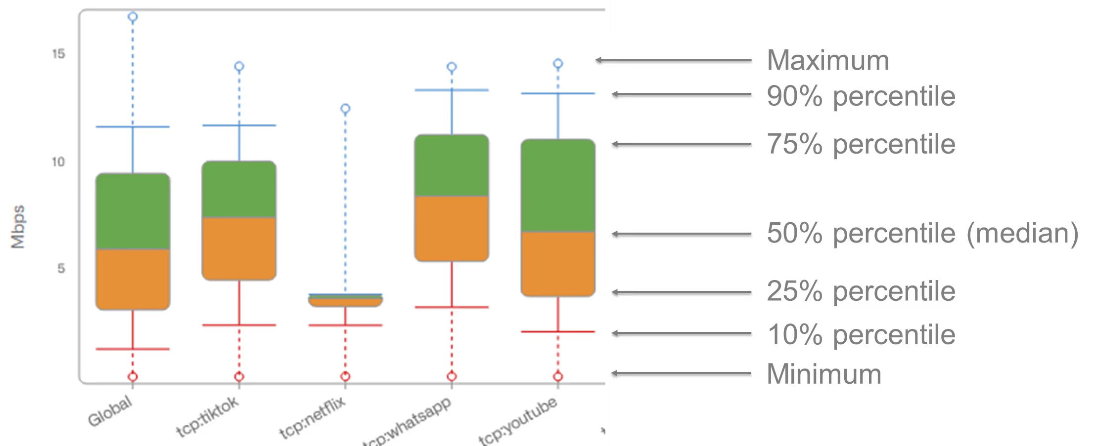
You may have noticed that the box plot is coloured. This is done to highlight the four quartiles:
- 1st quartile: percentiles from 0 to25%. Red.
- 2nd quartile: percentiles from 25% to50%. Orange.
- 3rd quartile: percentiles from 50% to75%. Green.
- 4th quartile: percentiles from 75% to100%. Blue.
So the 1st quartile is the lower 25% of values and the 4th quartile is the upper 25% of values.
Subscriber Dashboad
The subscriber dashboard includes a very comprehensive set of useful information about the subscriber current and past performance. It is the ideal place where to analyze and diagnose issues reported in the subscriber data access.
It can be reached by clicking on the subscriber ID or subscriber IP address in any of the following windows:
- Status->Subscribers
- Status->Flows->Per Subscriber
- Status->RADIUS/REST/Billing->Subscribers
The subscriber dashboard contains a lot of information, so use the scroll bar on the right-hand side to browse through it.

The dashboard contains the following information:
- Subscriber main session parameters (including the rate and monitor policies applied, IP and subscriber ID, etc.). Click on Additional details to see more information. Click View Subscriber Groups to go the list of groups that this subscriber is a member. Metrics of the subscriber can be compared to those of the groups, to assess if the QoE is within normal values.
- Dial icons with a summary of the latest metrics.
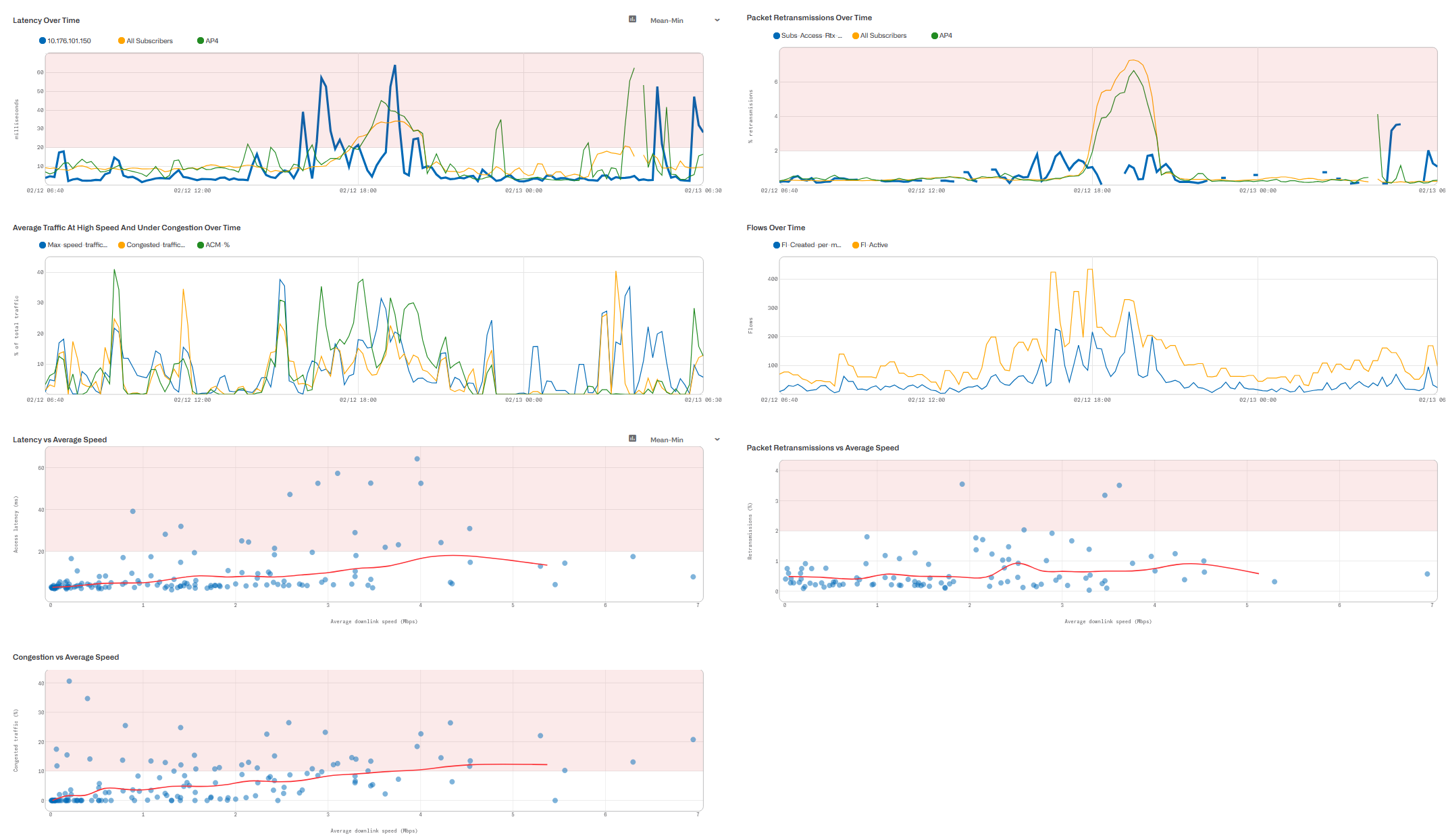
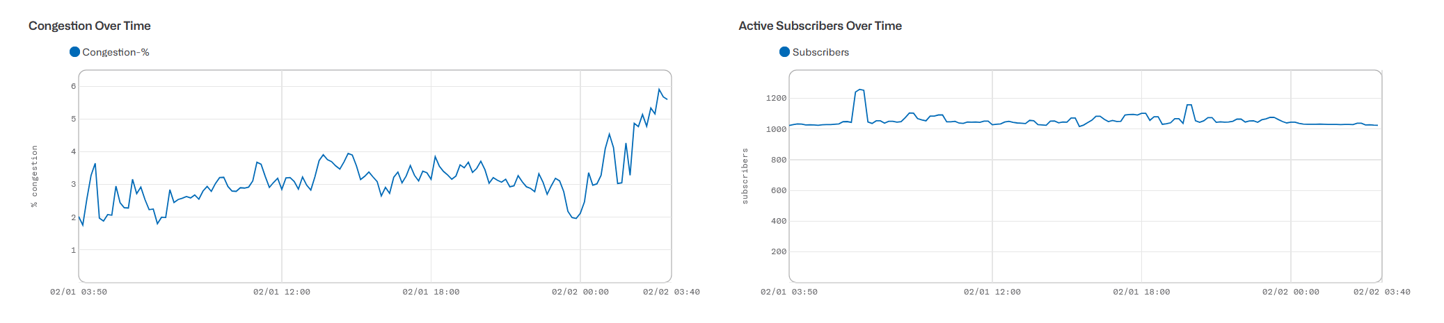
- Charts with the evolution overtime of the subscriber main metrics:
- Average and maximum speeds
- Latencies
- Packet retransmissions (losses)
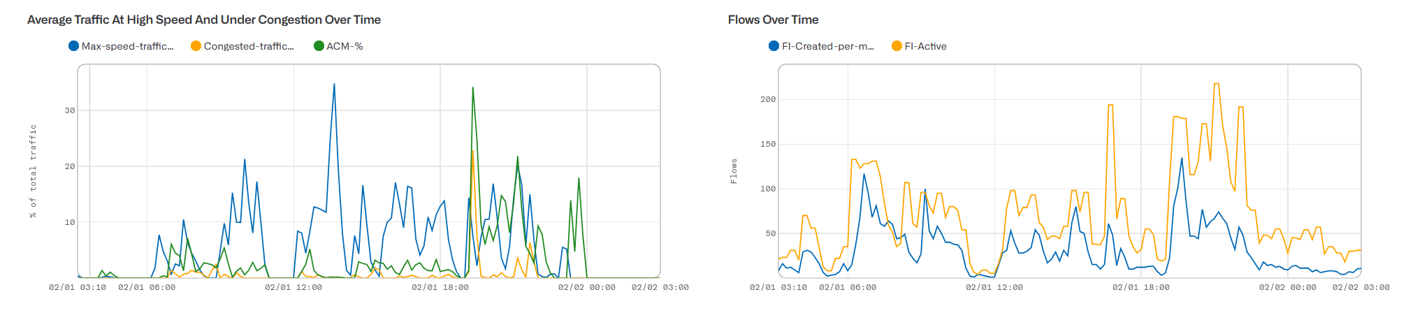
- Traffic at high speeds, suffering congestion and limited by ACM
- Number of flows (created per minute and active).
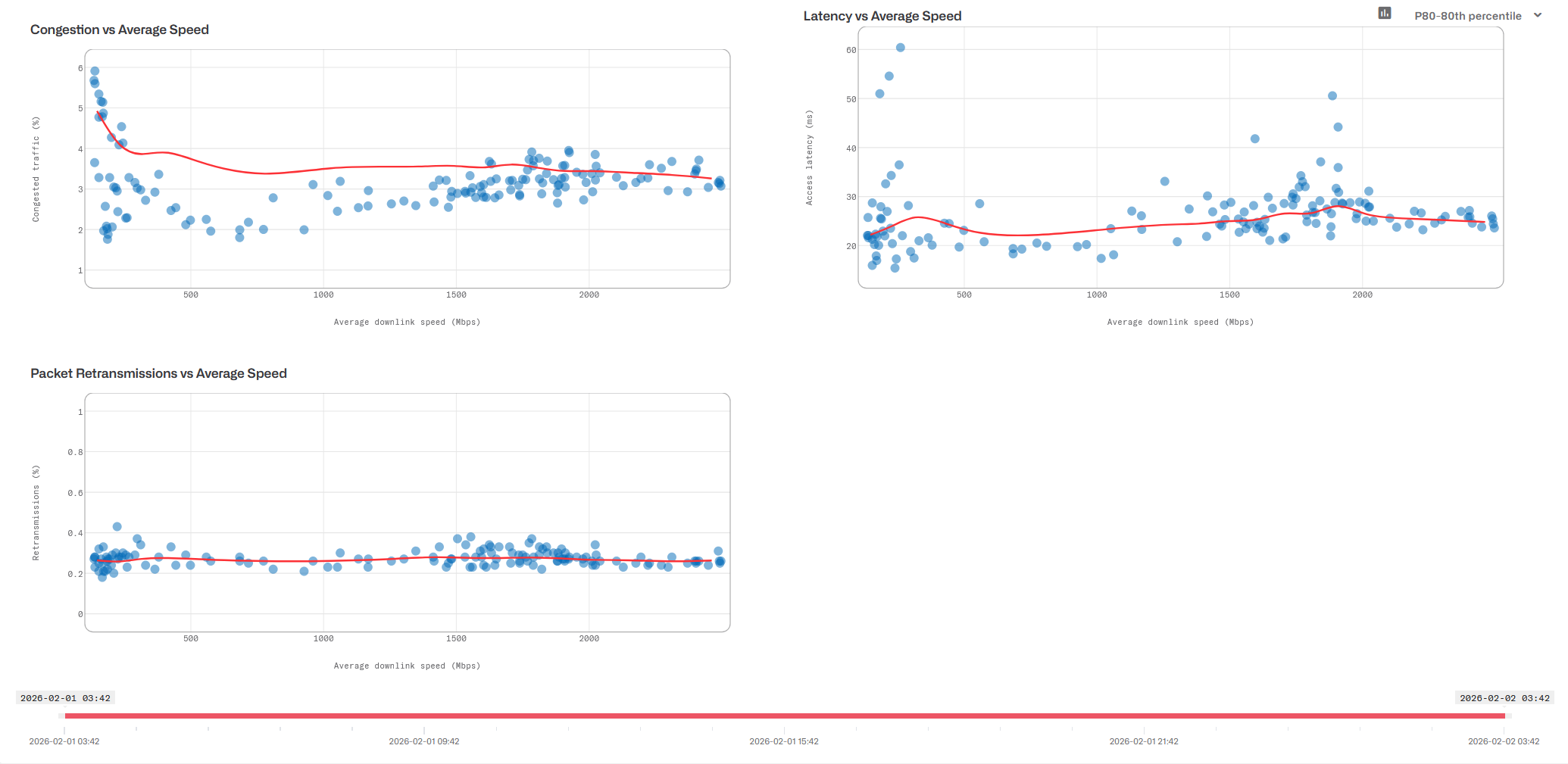
- Charts with latency, retransmission andcongestion vs the average speed.
- Chart with the application usage over time.
- Application flow speeds and their evolution over time.
- Distribution of Internet latencies per application and their evolution over time.
- Table with the active flows of the subscriber. Theflow policy is provided (click on the policy name to go to the policydefinition). If available, it also shows the DPI domain (DOMAIN column) and theDPI category of the flow (DPI column).
Live Mode
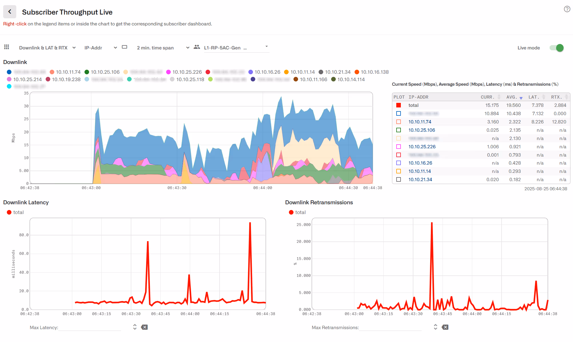
To monitor the subscriber more closely, set the Live mode switch to On. Charts will appear with the current evolution of the main metrics. A flow table will appear, including DPI composition. A maximum time span can be shown (latest number of minutes). This is configurable to 2, 5 or 10 minutes, using the selector next to the Live mode switch. When the time span is reached, e.g. after 5 minutes, the charts will continue being updated, showing the latest five minutes window. You can pause and resume the live mode to better analyze the information.
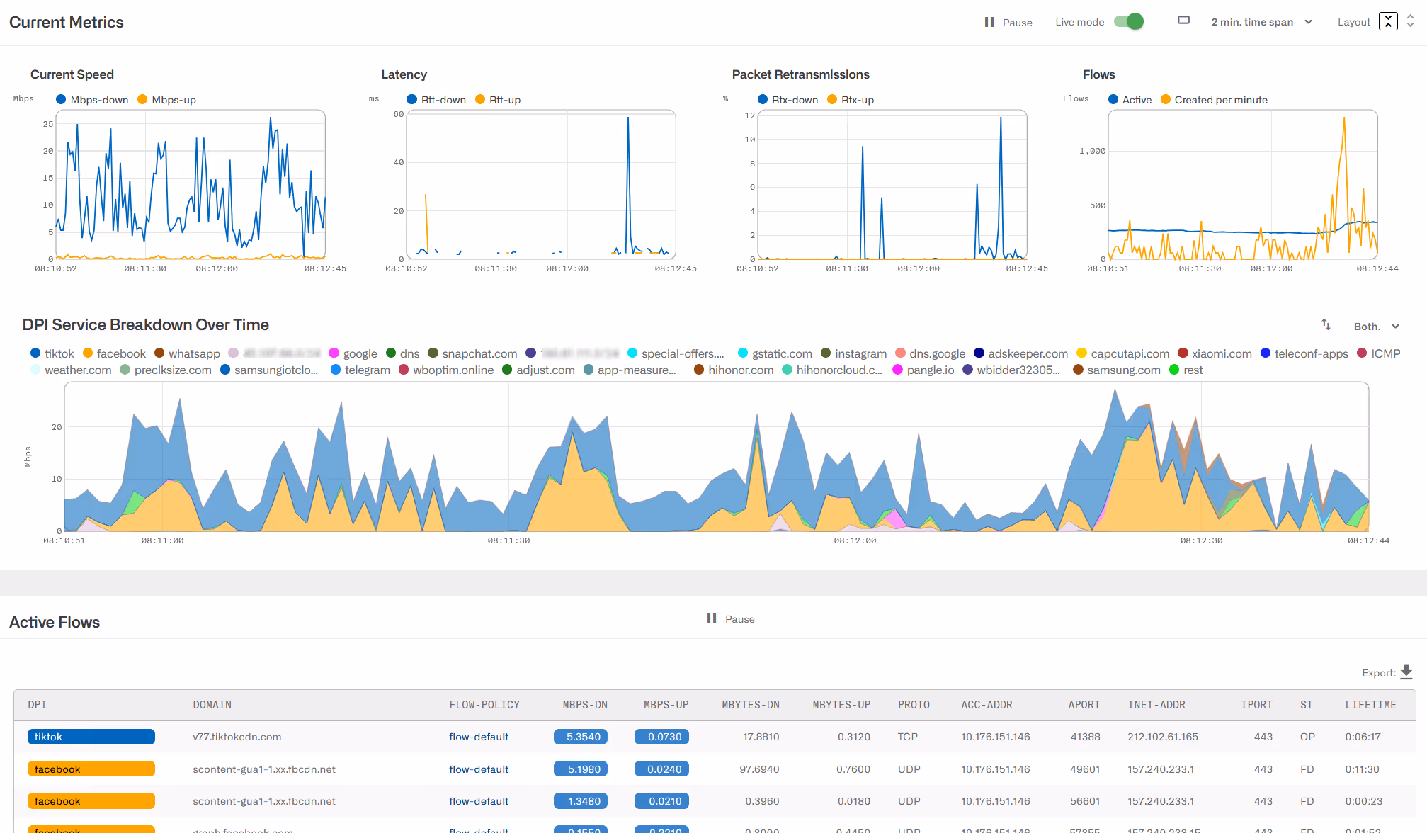
A flow table will also be included and will be continuously refreshed will be continuously refreshed. Flows are ordered in the table with active flows first, and among them, the faster flows. DPI categories and domains are shown. Not null speeds are highlighted in blue to facilitate the identification of active flows. You can display the life charts with more vertical space clicking on the Layout ↕ icon.
Note: live DPI information may not be available in certain countries due to export restrictions.
Subscriber Groups
The next chart is the result of pressing Click View Subscriber Groups. It shows this subscriber groups and compares those of groups with the subscriber metrics:
Historical Metrics
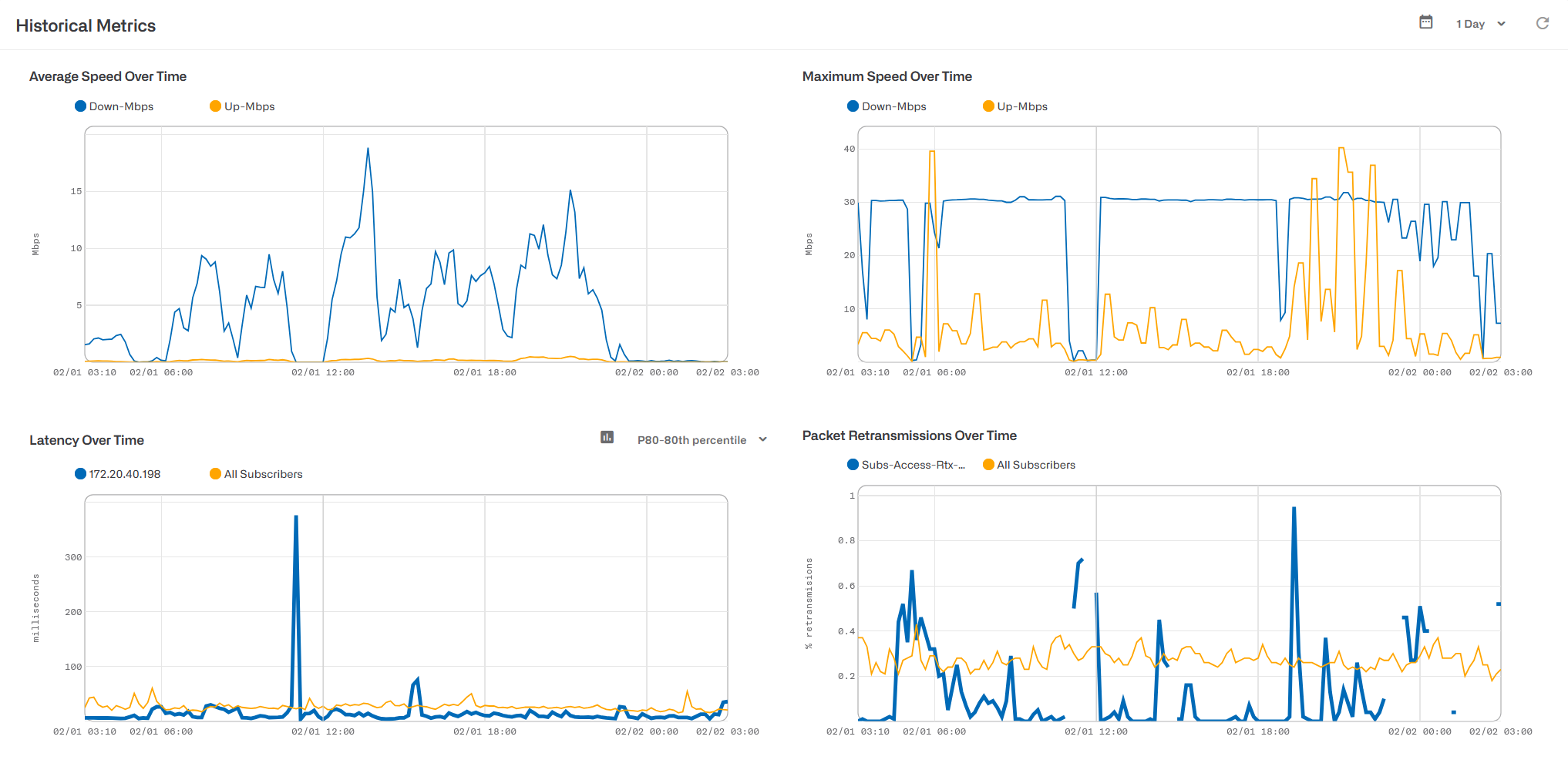
The previous charts show the evolution over time of average and maximum speed, access latency and retransmissions. For the access latency and retransmissions, the average of the subscriber groups and of the overall network are also included as a reference, to determine if the subscriber is below or above the average quality. Latencies are measured in three ways: as an average of minimum values (Mean-min), as a median and as a percentile 80 (value higher than 80% of the latency samples).
The next charts contain information about traffic close to maximum speed and in congestion, and the active flows and flows created pe rminute.
Three scatter-plots show the possible correlation between speed and measurements of latency, losses and congestion. For example, in the speed vs latency, a dot is a speed-latency pair measured at the same time. A red line shows the possible correlation between the two (the line that better adjust to the points).
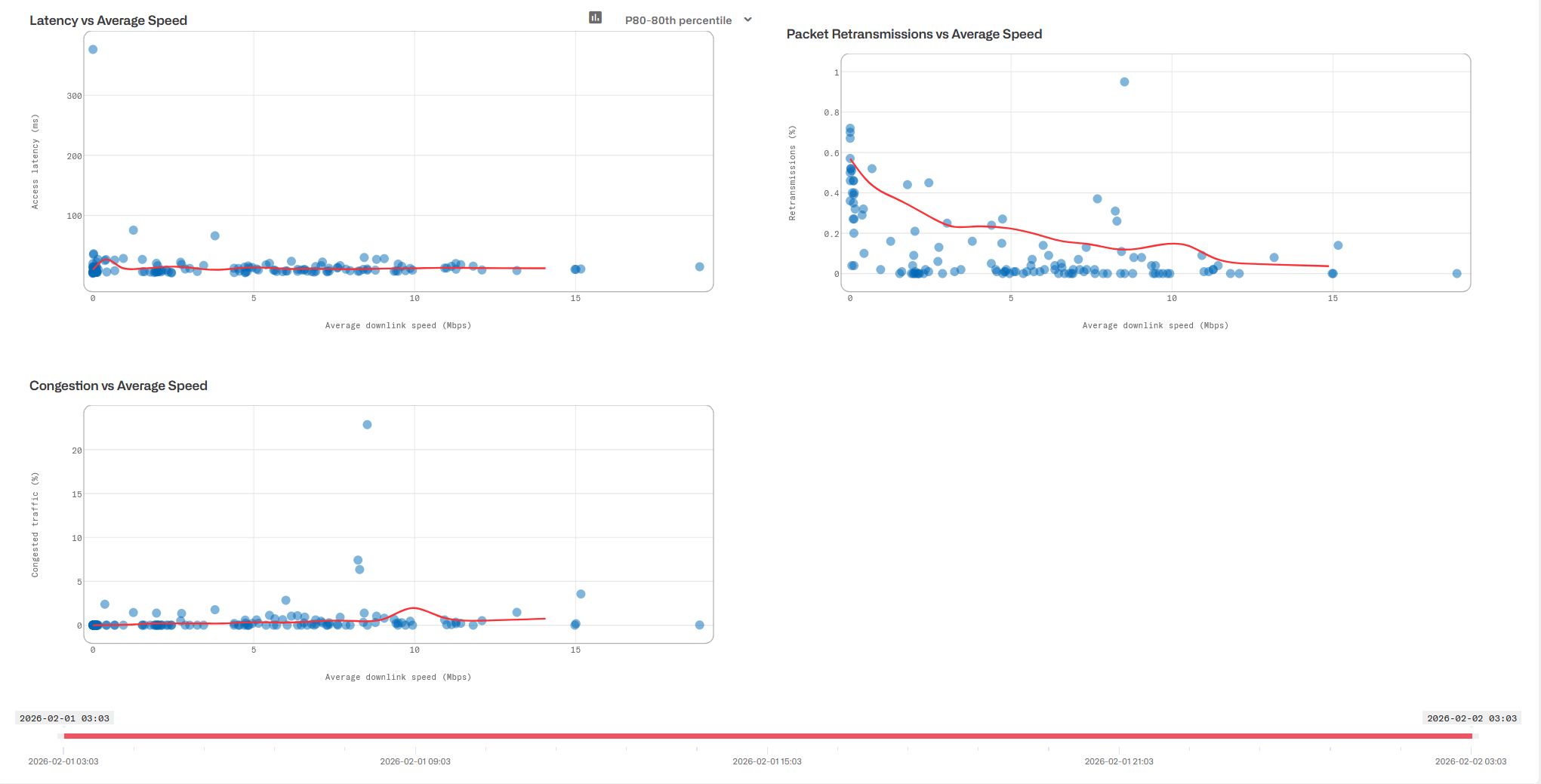
If the metrics go over the warning threshold values configured in the QoE metrics page, the chart area is highlighted. Charts with the warning highlight are: mean-min latency over time, retransmissions overtime, mean-min latency vs speed, retransmission vs speed and congestion vs speed. The following screenshot shows an example:
To hide the highlight, disable the switch Colorize warning threshold.
Application Metrics
This section shows a sample of subscriber usage for the applicationswith higher usage.
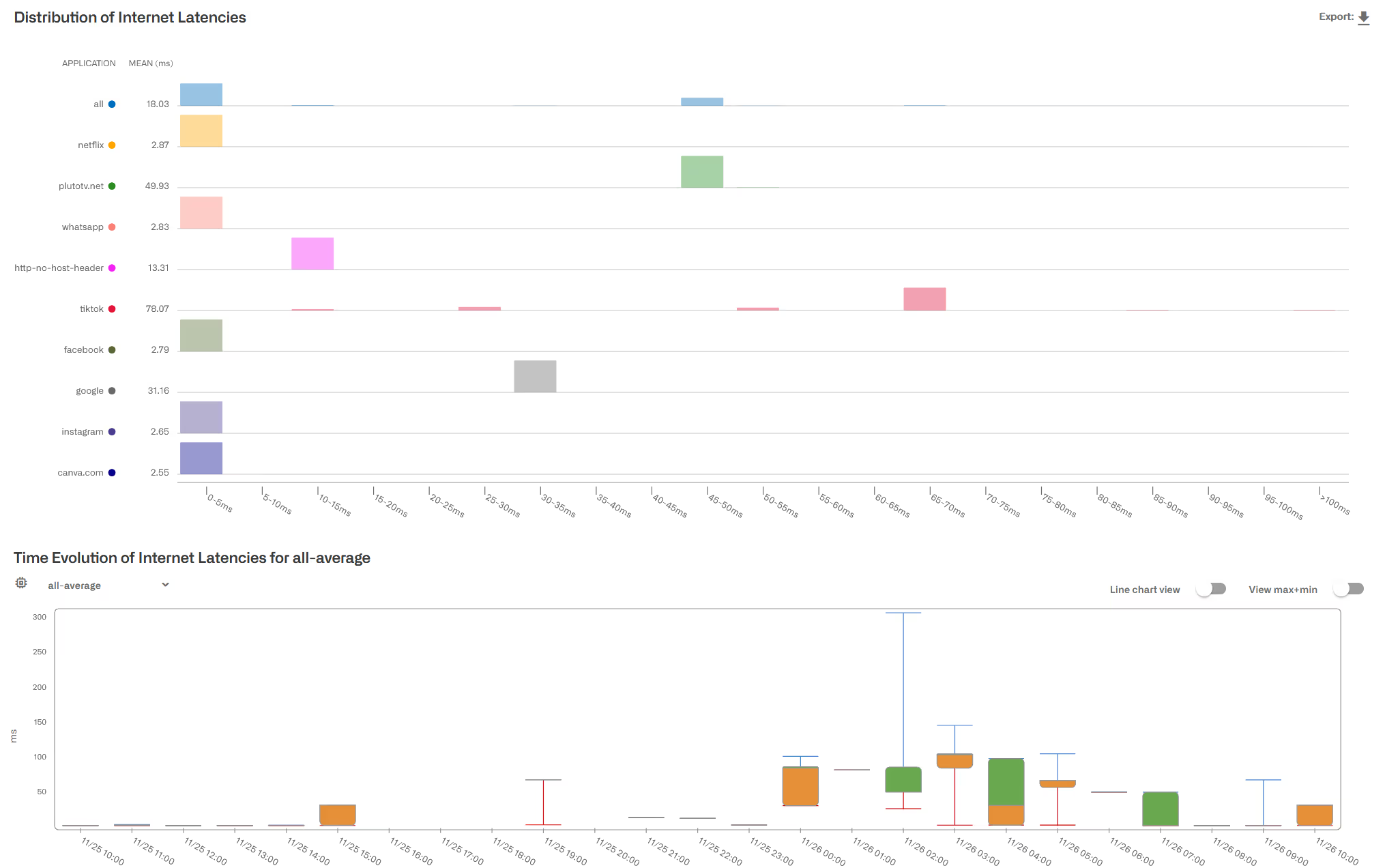
The first chart is the time evolution of application usage:

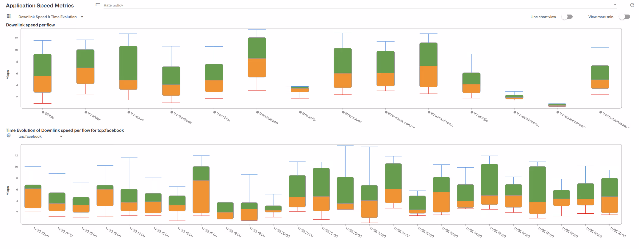
The average flow speeds and their evolution over time are also included. A box plot summarizes the speed distribution: percentiles 10, 25, 50 (aka median), 75 and 90. The minimum and maximum values, hidden by default, can also be shown enabling the View max+min switch.

Also, application latency distributions are shown, along with their evolution over time. Latencies are measured between the BQN and the application server over the Internet.
Note: DPI information may not be available in certain countries due to export restrictions.
Active Flows
A table at the bottom of the subscriber dashboard contains the main active flows by size. The table can be exported to a CSV file. Use the refresh icon to update the table (or go to Live mode for an automatically updated list of flows).

Note: DPI information may not be available in certain countries due to export restrictions.
Subscriber Identifier (ID)
To facilitate the identification of a subscriber session, a subscriber ID field is supported. The subscriber ID can be used when requesting metrics, to obtain historical information even when the subscriber has changed IP address over time.
There are several possible sources for the subscriber ID:
- MAC access address (this is the default). In some networks, the MAC address might be the same for all subscribers (for example if all traffic is coming from the same router port) but in other networks, it may identify the subscriber access points.
- Subscriber access IP address. To configure the IP address to fill the subscriber ID, go to Administration->General Settings->Default subscriber-ID source.
- An external system: the external system can use the BQN REST API, RADIUS or one of our Billing.Go to those sections for details.
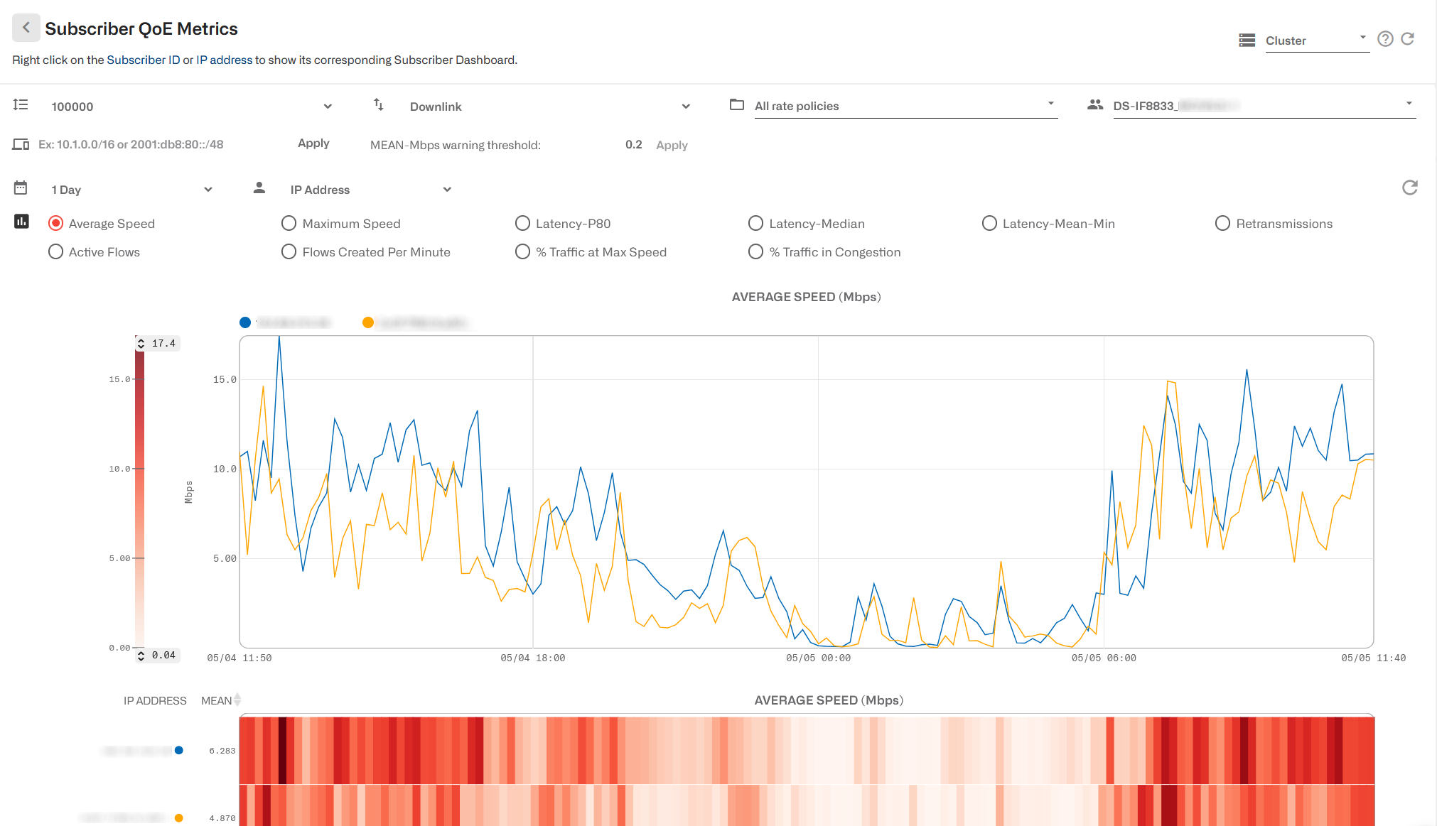
Subscriber QoE Metrics
Status->Subscribers gives access to the list of active subscribers along with their metrics (if the subscriber of interest is not listed, type the IP address on the filter field).
The following metrics charts are available:
- Average speed
- Maximum speed
- Latency-P80: percentile 80th of access latency.
- Latency-Median: median value of access latency.
- Latency-Mean-Min: average of minimum access latency values.
- Retransmissions
- Active flows
- Flows created per minute
- Percentage of traffic at maximum speed
- Percentage of traffic with congestion
Metrics over time
On the top of the page, there are a few selectors affecting the information shown:
- Maximum subscriber entries loaded. 100,000 by default,of which the first 25 are shown (the ones with biggest traffic consumption).You can increase this number to up to 1,000,000.
- Metric direction (downlink or uplink). For example,downlink latency is the latency on the access network and uplink latency, the latencyon the Internet side.
- Policy filter: selects subscribers with aspecific rate policy.
- Group filter: selects subscribers members of aspecific group.
- IP address filter: you can enter one specific IPaddress (v4 or v6) or an IP address range (using /mask).
- MEAN-Mbps warning threshold: this field isrelated to warning thresholds and will be explained there.
- A time interval selector: shows last 24 hours(default), up to 3 months.
- IP address or subscriber ID selector: bydefault, subscribers are labelled by their IP addresses, but it is also possibleto show them by subscriber identifier (subscriber identifiers are assigned toIP addresses by RADIUS, Billing or REST API).
- Metric selector: the metrics to show. Averagespeed is the one selected by default.
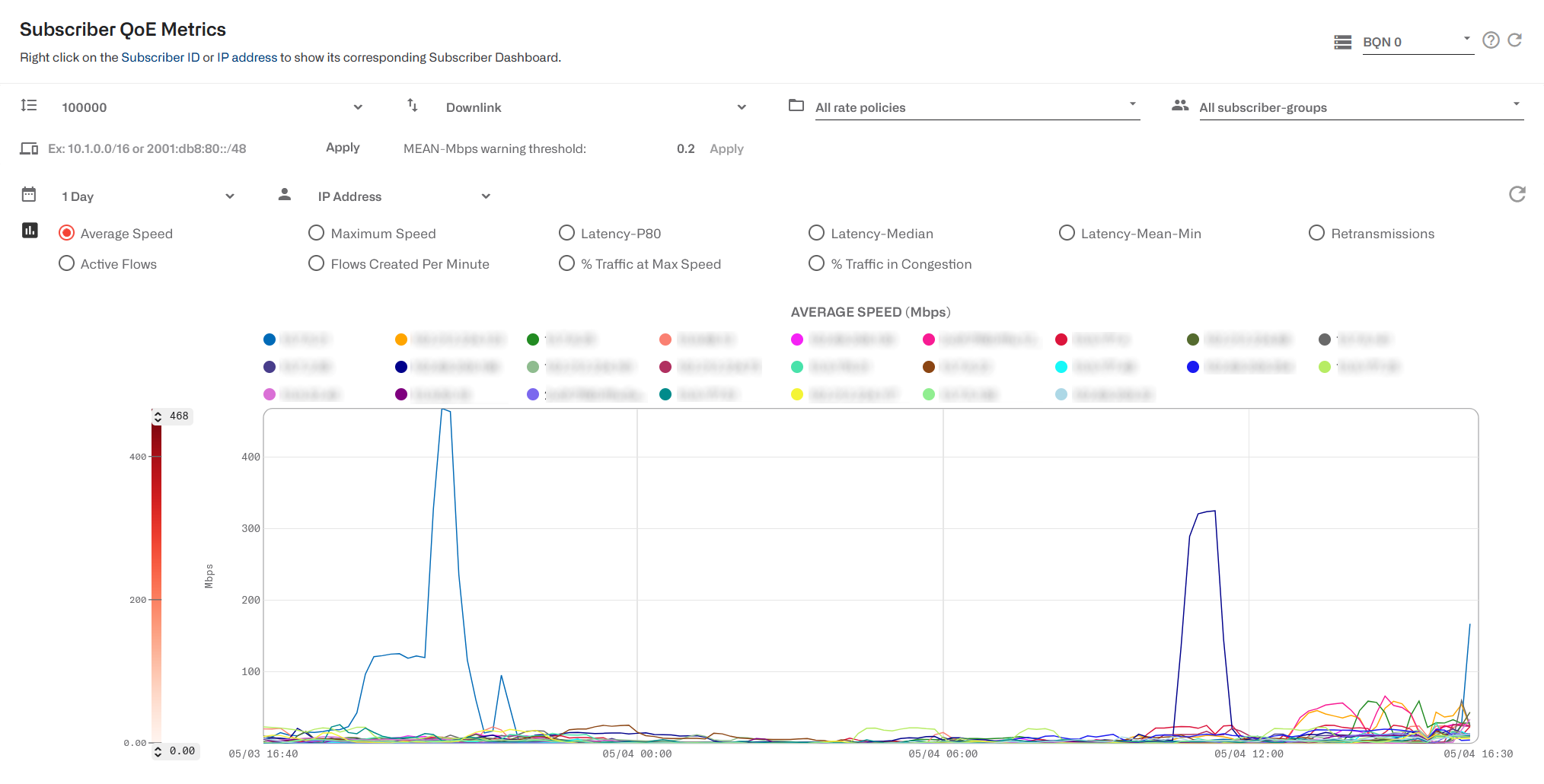
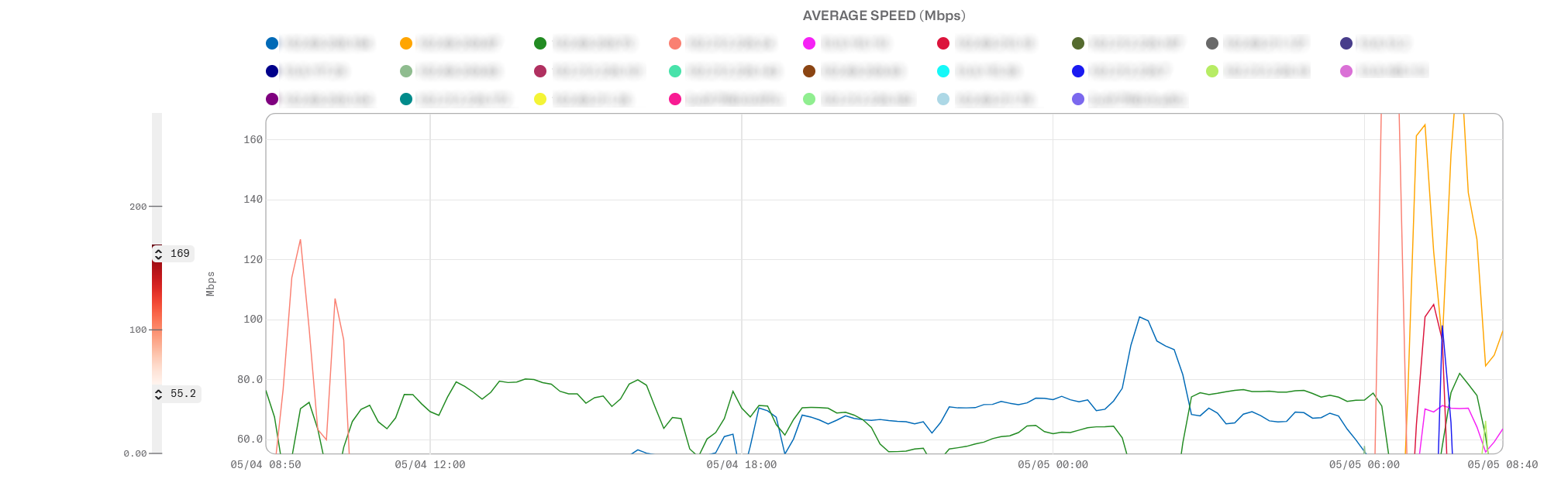
Time evolution of the selected metric is shown as a line chart.
Right-clicking on an IP or ID of the chart legend will lead to that subscriber’s dashboard.
The visible value range can be adjusted dragging the maximum and minimum values to the left of the chart:
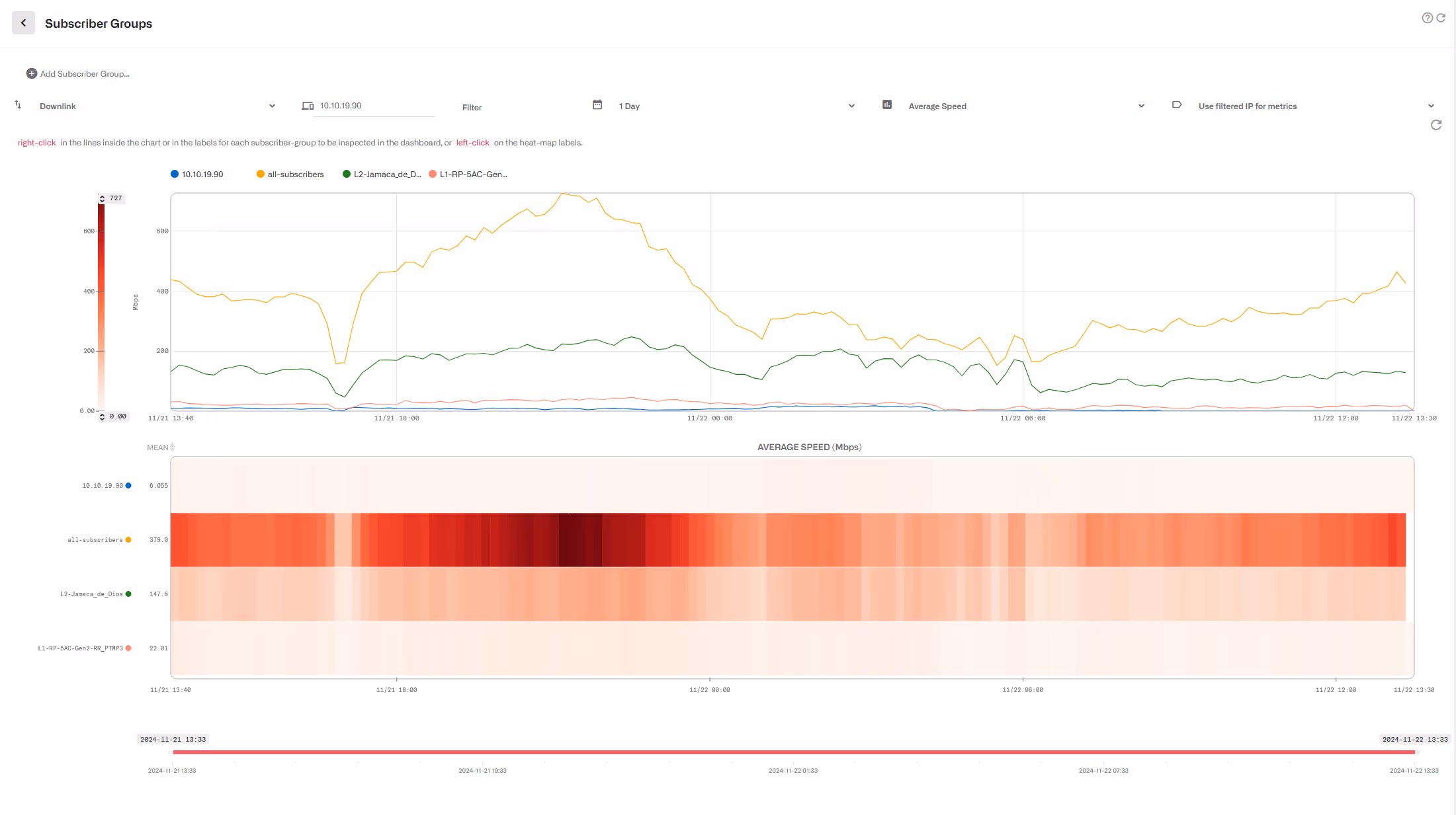
Heatmaps and Box Plots
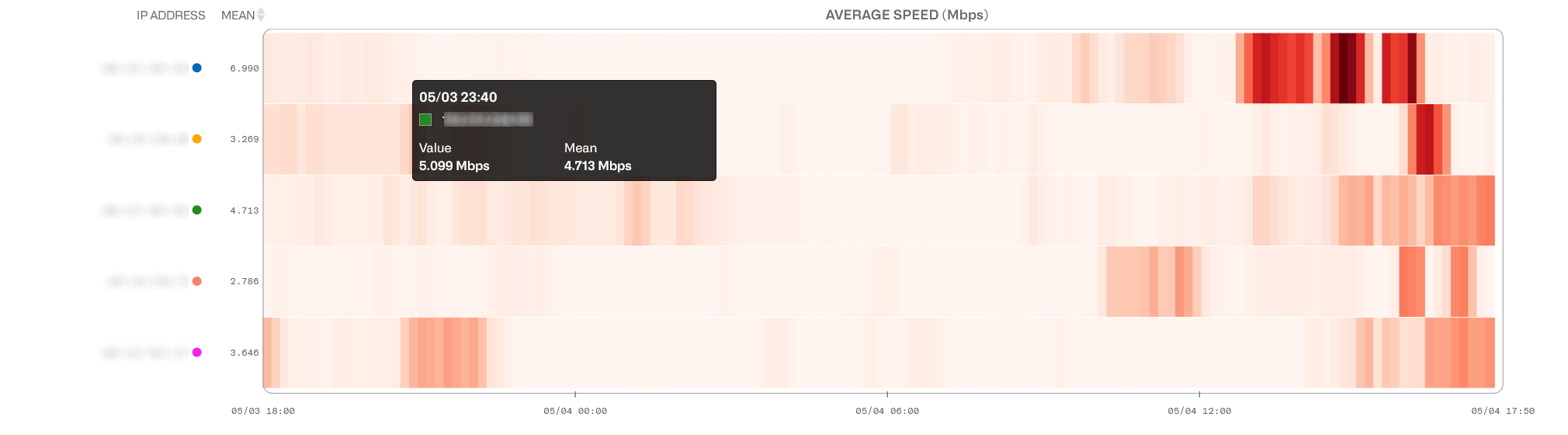
To facilitate the analysis of the metrics, we show them also as heatmaps and as box plots.
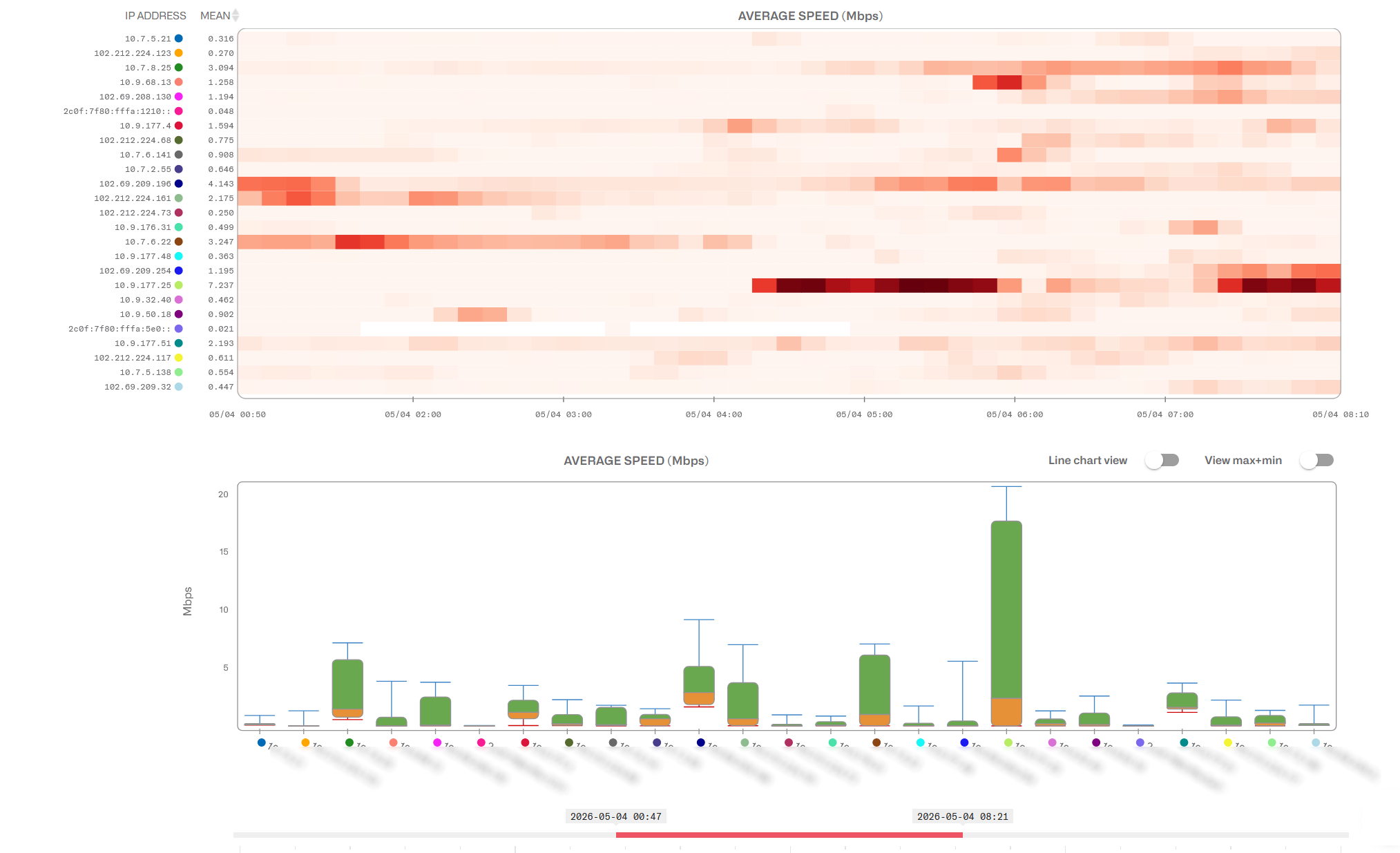
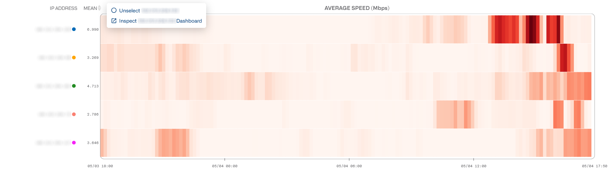
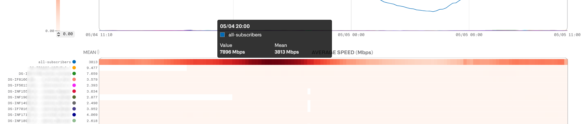
The heatmap represents a scale of color intensity that maps the metric range. This is shown with a color scale to the left of the metric chart. The higher the number, the higher the color intensity. Each subscriber has a row with the evolution of the metric over time. Click on the row to unselect that subscriber or to go to the subscriber dashboard.
A MEAN column on the left of the heatmap shows the averagevalue of the metric, for each subscriber, during the selected period of time.The subscribers can be sorted by that average value in ascending or descendingorder.
The color scale is adjustable. Dragging the minimum andmaximum values in the time evolution chart will focus the color range to that metricinterval, leaving values below and above painted in the lighter and darkercolors respectively. This helps to focusthe analysis, zooming into that metric interval. The MEAN value will beadjusted to the selected interval, with values outside the range rounded to theinterval limits.
Placing the mouse over a heatmap cell shows its exact time and value.
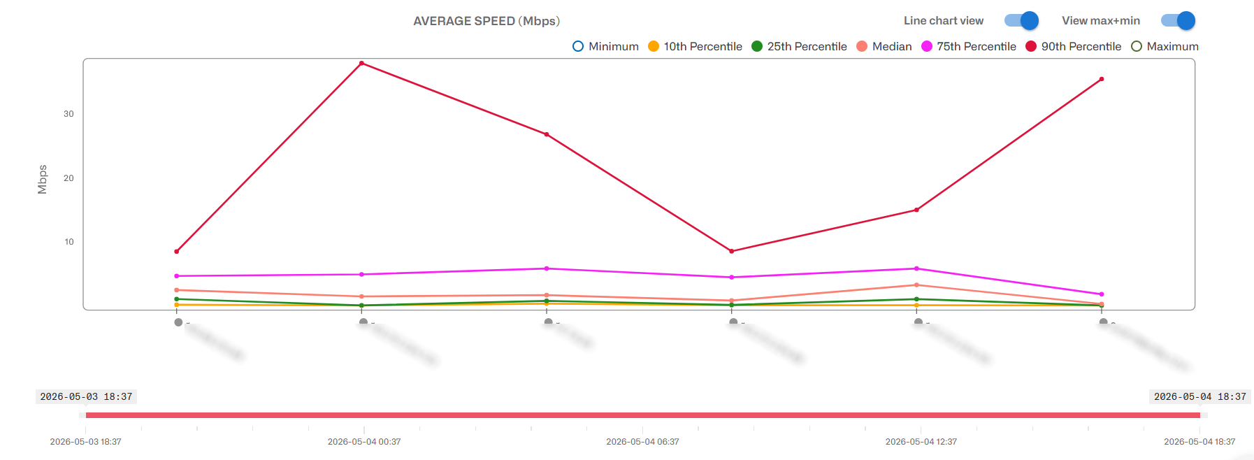
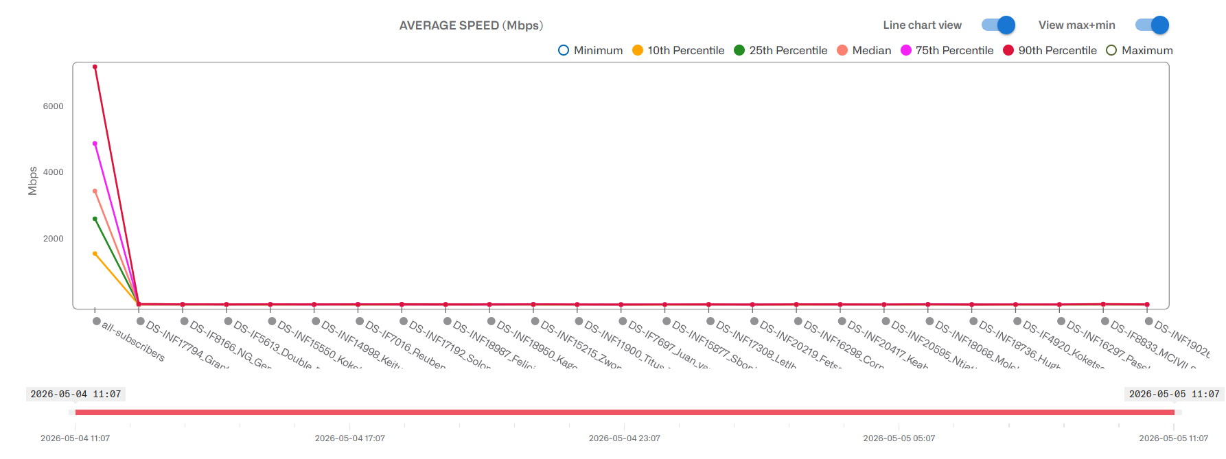
In the box plot,, one can see the distribution of metrics for each subscriber during that period. You can add the minimum and maximum values and also, to facilitate comparisons between subscribers, change from box plot to line charts.
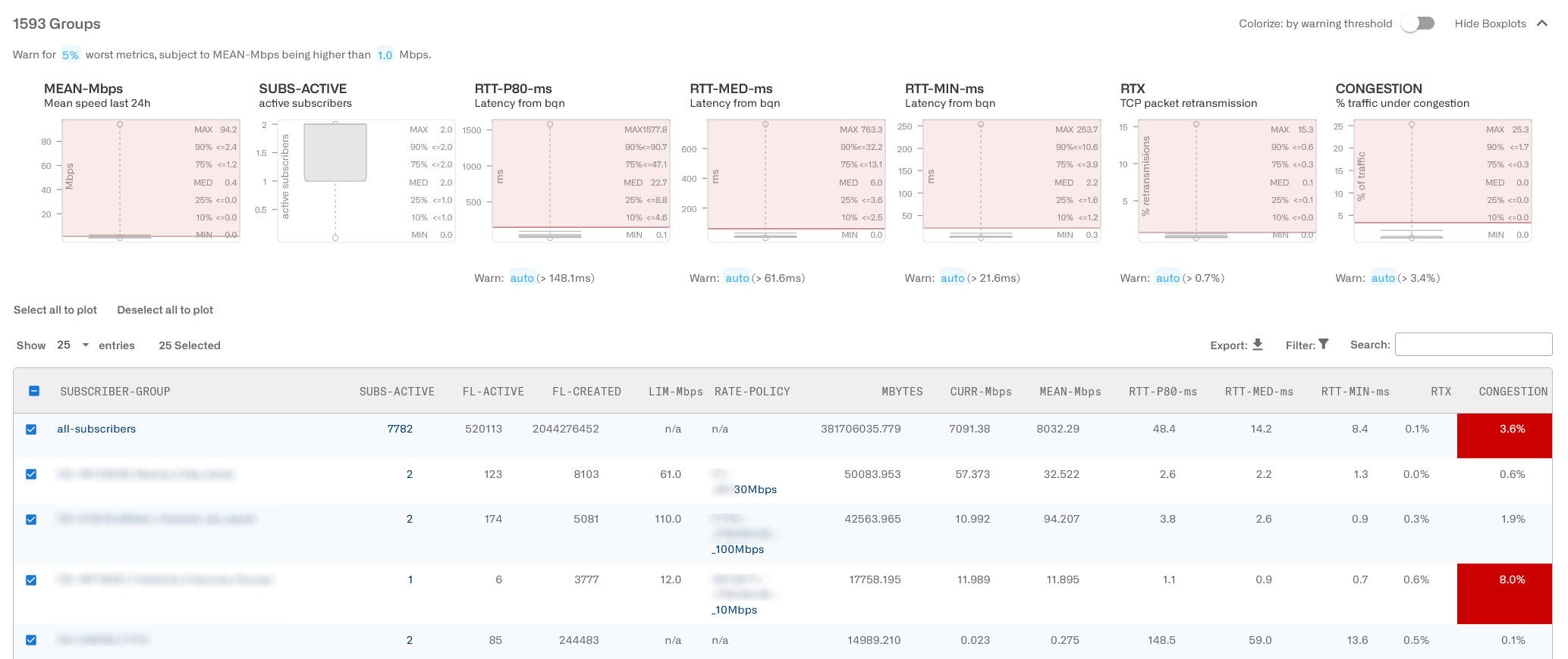
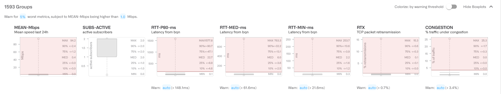
Overall QoE Box Plots
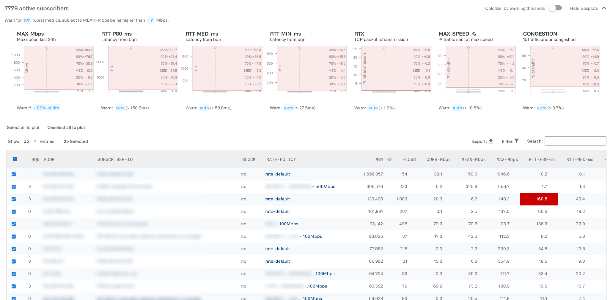
Five box plot charts summarize the distribution of the following key metrics across all the subscribers:
- MAX-Mbps: maximum speed in Mbps.
- RTT-P80-ms: percentile 80th of latency in milliseconds (p80 is the value higher than 80% of the obtained measurements).
- RTT-MED-ms: median latency in milliseconds.
- RTT-MIN-ms: mean of minimum values of the latency in milliseconds (RTT-ms in previous releases).
- RTX: packet loss rate in percentage.
- MAX-SPEED: percentage of time the subscriber is at a speed close to maximum speed.
- CONGESTION: percentage of the traffic suffering congestion.
Each box plot shows the maximum and minimum values as well as intermediate percentiles, median included (MED).
A configurable threshold helps to identify metrics so high that may lead to customer quality of experience issues.
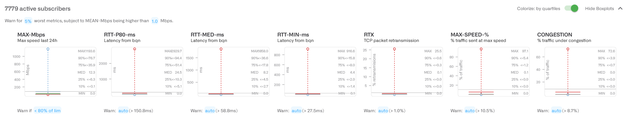
By default, the threshold is calculated automatically as the percentile 95th or, in other words, a threshold exceeded by 5% of the measurements. You can change it by clicking on the blue 5% label. To avoid highlighting subscribers with very low activity, where metrics are not representative, only those with a mean speed about 1 Mbps are highlighted. This can also be changed, but normallyit is not necessary. In the example, we have at the top: Warn for 5% worst metrics, subject to MEAN-Mbps being higher than 1.0 Mbps.
In the example above, the RTx threshold has been set automatically to 1%, the box plot will shade in red all values between 1% and the maximum.
You can set any threshold to a specific value. Click on the threshold blue label and use the dialogue.

MAX-Mbps threshold is a little bit different. It has no auto option and it is set to 80% by default (i.e. the maximum speed reached is lower than 80% of the subscriber rate plan). The subscribers below the threshold are highlighted, instead of above it, because in this case, the higher the better.
Instead of highlighting in red the values above the warning threshold, it is possible to highlight four quartiles by color. Set the switch Colorize in the upper right.
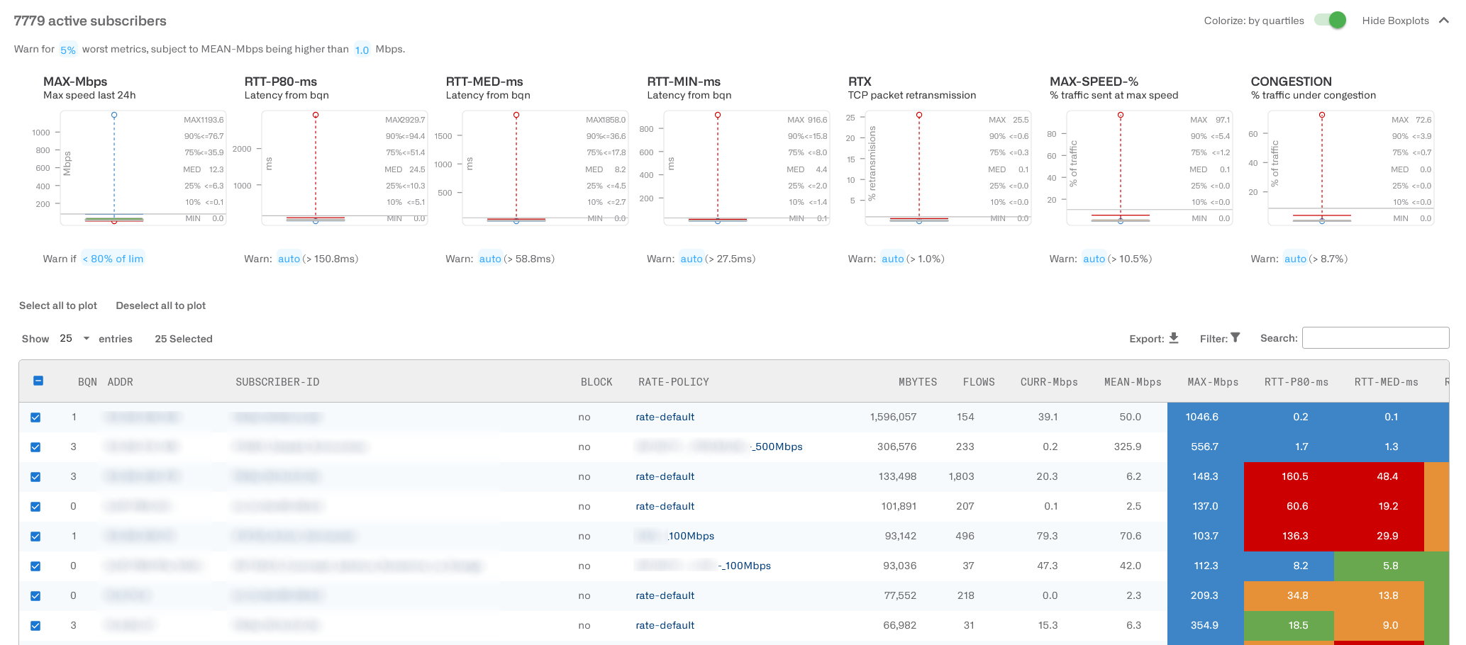
Please note that, except for MAX-Mbps, the convention is the opposite to other box plots (1st quartile in blue, 4thquartile in red), because for QoE metrics, the lower the value the better (lower latency or rtx for example).
Active Subscriber Table
A table contains detailed information about all active subscribers.
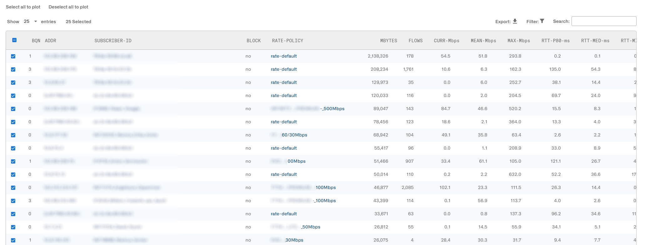
The information provided in the table is as follows:
- BQN: identifier of the BQN server where the subscriber is located.
- ADDR: subscriber’s IP address.
- SUBSCRIBER-ID: subscriber identifier. MAC address by default. It can be filled using external system information (see RADIUS, Billing, and REST API sections).
- BLOCK: whether the subscriber is subject to any blocking. Blocking normally means that the subscriber traffic is completely blocked, but other possibilities exists: blocking with redirections and blocking slowing down the traffic instead of stopping it completely. A subscriber may be blocked for a number or reasons: quota exhaustion, a blocking rate policy, billing status, etc. More information is provided in the Subscriber Blocking section.
- RATE-POLICY: name of the rate policy being applied to this subscriber.
- MBYTES: total traffic volume of this subscriber session in this direction (downlink or uplink), since session started (see LIFETIME for session duration so far).
- FLOWS: total number of currently active traffic flows (mainly TCP connections and UDP flows) of this subscriber. Active means that the flow is exchanging traffic.
- CURR-Mbps: current speed in Mbps (calculated every second).
- MEAN-Mbps: moving average of subscriber speeds calculated over ten-minute periods.
- MAX-Mbps: maximum speed in Mbps over the last 24 hours. Every ten minutes, the maximum current speed is registered. We take the maximum among them for a 24 hour period (or the session lifetime if less than 24 hours).
- RTT-P80-ms: percentile 80th of latency in milliseconds (p80 is the value higher than 80% of the obtained measurements). If the downlink direction is selected, the latency shown is on the access side (towards the subscribers). If uplink direction is selected, the latency on the Internet side is shown.
- RTT-MED-ms: median latency in milliseconds.
- RTT-MIN-ms: mean of minimum values of the latency in milliseconds (RTT-ms in previous releases).
- RTX: moving average of packet loss calculated over ten-minute periods. The packet loss is obtained from TCP retransmission percentages. If the metrics shown are of the downlink direction, this loss is the loss between the BQN and the subscribers. If the uplink direction is shown,the loss will be between the BQN and the Internet servers.
- MAX-SPEED-%: moving average of the percentage oftime when the subscriber is at a speed close to the maximum speed. This percentage is measured every ten minutes.
- CONGESTION: moving average of the percentage of traffic volume suffering congestion. This percentage is measured every ten minutes.
- WARN: number of measurements above their warning threshold. Consider that subscribers with an average speed below the MEAN-Mbps warning threshold will not be highlighted with a warning. This is to avoid outlier values from connections with very little usage.
- LIFETIME: duration so far of this subscriber session.
- Last column: tick this box if you want this subscriber metrics to be show in the charts.
A click on the subscriber IP address or ID leads to the subscriber dashboard.
The table can be sorted by any column by clicking on it, for example, click on RTT-ms to show subscribers with the biggest latency first.
You can use filters to select subscribers meeting some elaborate criteria, like having latencies within a range (see Table Column Filters for more details). The Search box can also be used tos elect rows matching a value in any column. Subscribers filtered in the table will be reflected in the rest of the page charts.
It is possible to Export the table content to a CSV file.
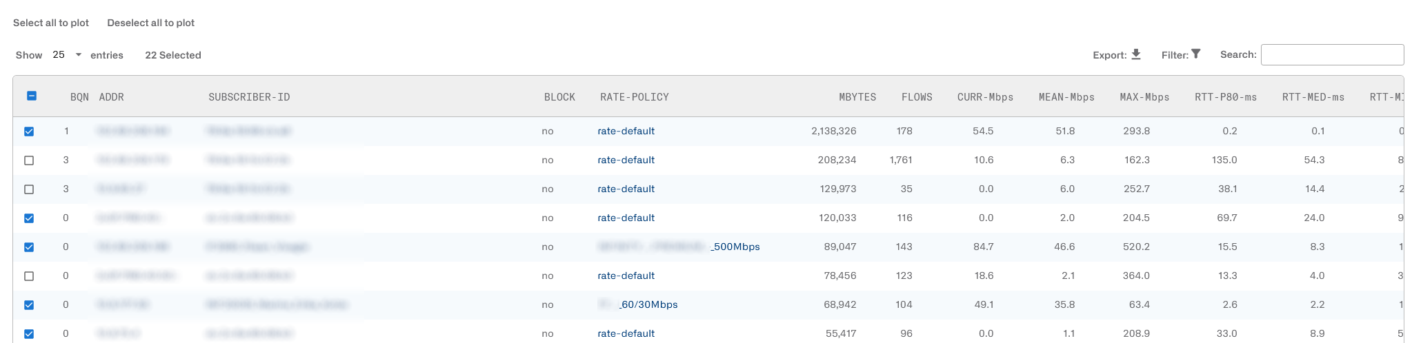
You can plot the default first 25 subscribers or unplot them clicking on the Select all to plot and Deselect all to plot buttons respectively.
You can also plot individual subscribers, up to a maximum of 50, selecting their plot tick box in the first column of the table and waiting a few seconds. Unselecting the plot tick will remove that subscriber from the chart.
In the table, the values above the warning threshold will be shaded in red, so the affected customers can be identified easily. The WARN column in the metrics table shows a score with the number of metrics above their warning threshold. Sorting the table with the highest WARN values first will show the subscribers with the more severe QoE issues.
To avoid highlighting subscribers that are simply inactive, a threshold is applied to the mean speed (MEAN-Mbps warning threshold,on the top of the page). If a customer does not reach at least this mean speed,he won’t get a warning score and won’t be highlighted. The threshold can be changed, but in general this is not needed.
Top Subscribers by Usage
The menu entry Statistics->Subscribers Analysis->Hourly Volume displays the subscribers with the largest traffic consumption over time. Usage can be shown per IP address or by Subscriber Id using the appropriate selection. The next example shows usage per IP-Addr:

You can go to a subscriber dashboard page by right-clicking on the IP address or subscriber ID in the chart legend.
The Statistics->Subscribers Analysis->Total Volume shows the total in the period being considered. The next example shows usage per Subscriber ID:

You can go to a subscriber dashboard page by clicking on the IP address or subscriber ID in the pie chart.
It is also possible to export to a CVS file with the usage of up to 500 top subscribers.
Traffic and Subscribers per Policy
Statistics->Subscribers->Per Policy shows the split of the subscribers into the different rate policies.

Statistics->Subscribers->Per Policy shows the split of the traffic volume into the different rate policies:
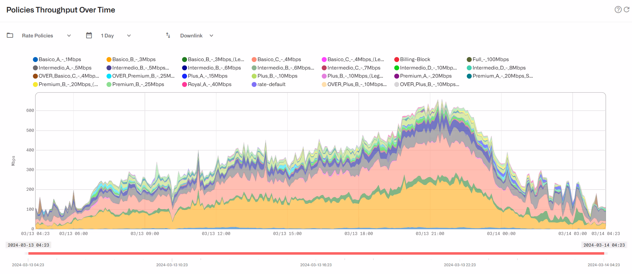
Statistics->Subscribers->Per Policy can also show the split of the traffic volume into the different flow policies:
Traffic per Application
In Statistics->DPI Analysis there is information about traffic composition.
The BQN shows the overall traffic composition per service in Statistics->DPI Analysis->Total Volume per Application.

The hourly evolution can be obtained in Statistics->DPI Analysis->Hourly Volume per Application.
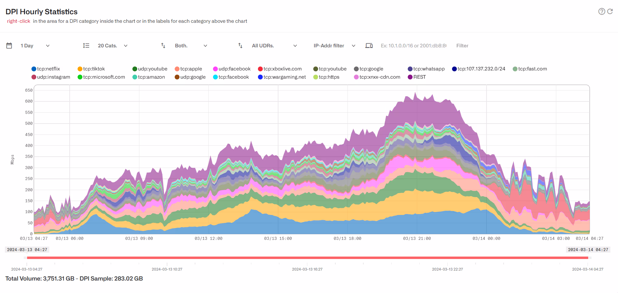
By default, all DPI samples are considered by the reporting (All UDRs), both the samples generated automatically by the BQN and those generated by monitoring policies. If the monitoring policies generate so many samples that they can cause a bias in the reporting, those samples can be excluded by selecting Only auto UDRs . This could be the case if several subscribers have a monitoring policy that generates UDRs for all their traffic and make them over-represented in the traffic sample mix.
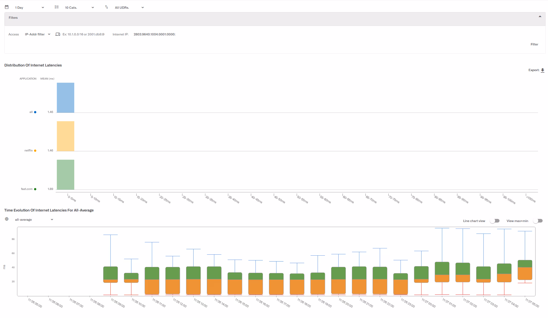
Latency per Application
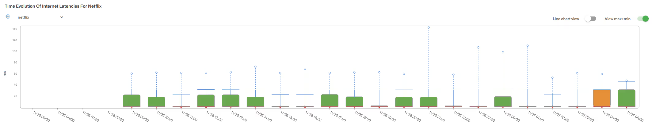
To see the latency per application,go to Statistics->DPI Analysis->Latency per Application.
A distribution histogram shows how latencies are spread in each of the main applications. The histogram shows the percentage of measurements falling into intervals of the range of latency values. To the left, close to the application label, you can find its mean latency value.

Below, the evolution over time of those Internet latencies is provided as box plots. Select which category to show on the option menu under the chart title.

By default, minimum and maximum values are not included to focus the analysis on the most common values (over 10% of samples and below 90%). You can include minimum and maximum values enabling View max+min.
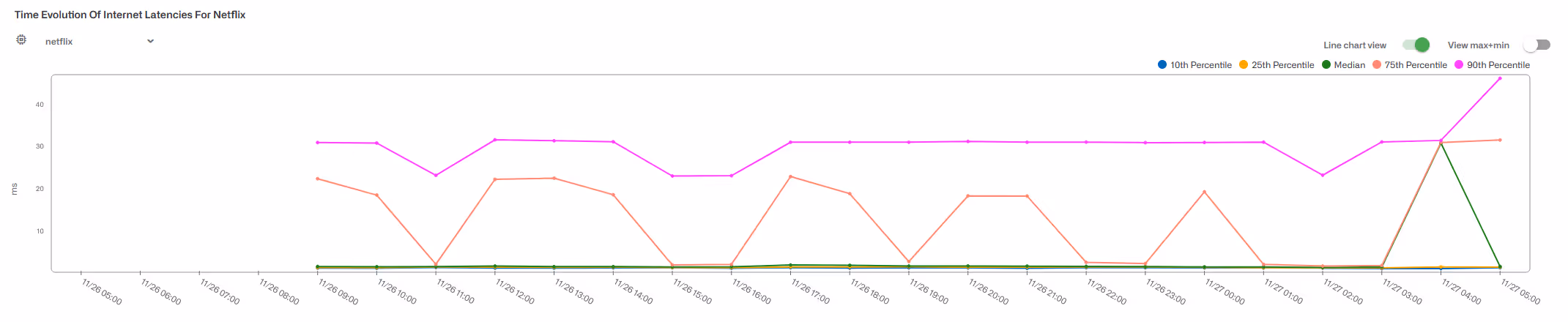
It is also possible to switch to a line chart view, to follow better how the percentiles change over time:
The latency analysis per application can be further refined filtering by subscriber (identified by IP address/range or by subscriber ID), and/or by an Internet-side IP address/range. The following examples filters by Internet IP address:
Speeds per Application
This page is under Statistics->DPI Analysis->Application Speed Metrics.
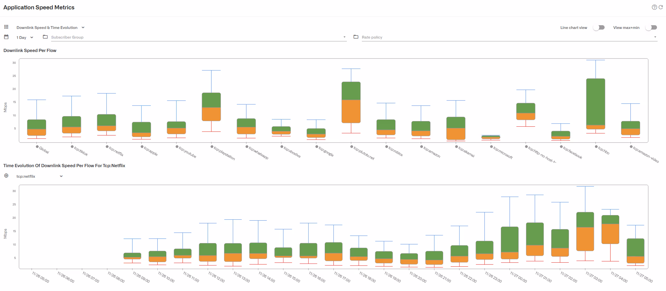
In time evolution, you can select the application to inspect.
To compare metrics obtained in more homogeneous conditions, because the subscribers have the same rate plan or belong to the same group, the metrics can be restricted to a few subscriber groups and/or policy rates.
Uplink speeds and evolution are also available:
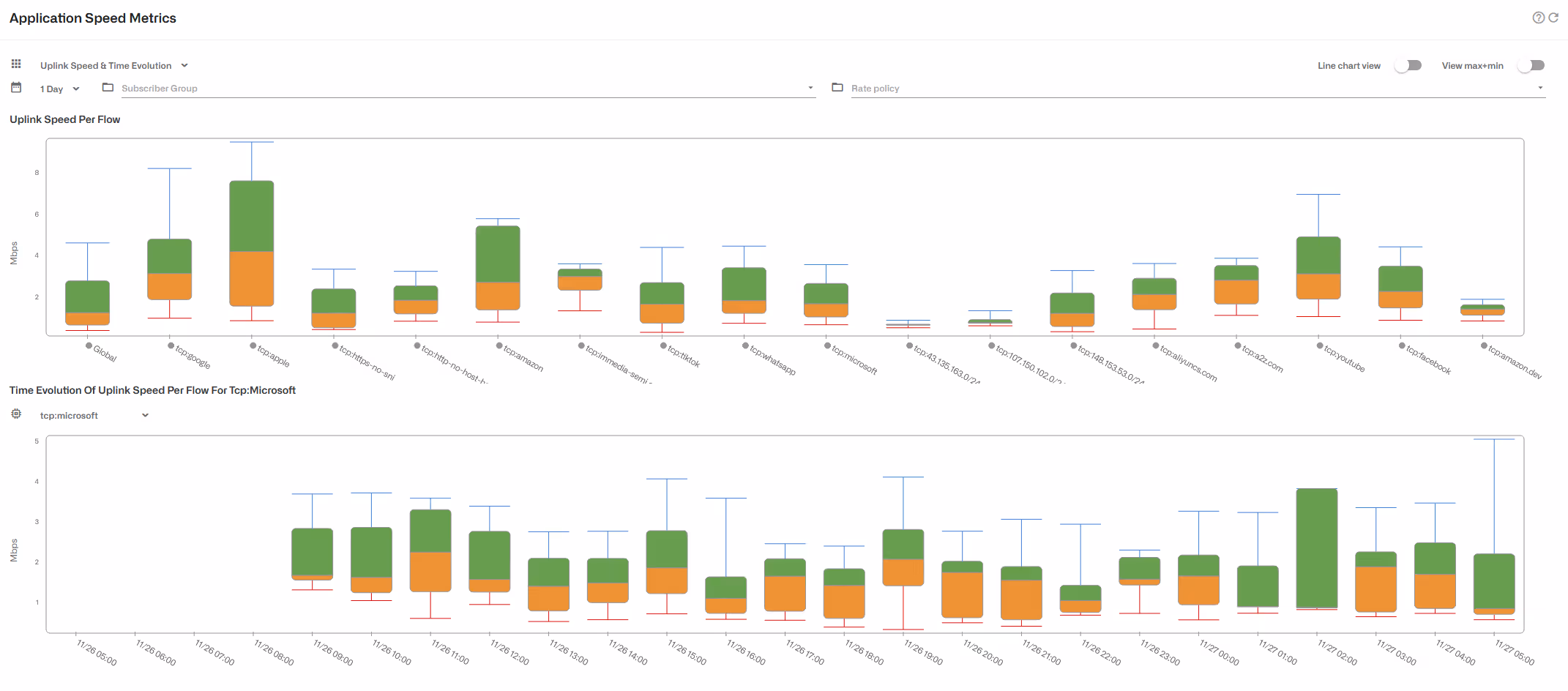
In addition to the box plots, a line chart view depicts the metrics as lines, with the possibility of deselecting values of less interest (e.g. maximum values)..
Main Subscribers per Application
It is possible to identify the main subscribers of a given applicatiob, both subscriber IDs or addresses (access-side IPs) and addresses of content servers over the Internet.
In Statistics->DPI Analysis->Total Volume Per Application, click on the pie sector of the application whose main IPs you want to display. A histogram of the main IP addresses will be shown, with server IP addresses at the top and subscriber addresses at the bottom. The histogram shows the percentage of the total application volume of that IP address.
It is also possible to show top subscriber IDs using the selector at the bottom of the page.

Addresses are clickable: server IPs will lead to latency distribution for that server IP and subscriber IPs or IDs will go to the subscriber dashboard.
To obtain a CVS file with the server or subscriber volume percentages, click on the Export icon.
Overall Traffic Metrics
Throughput
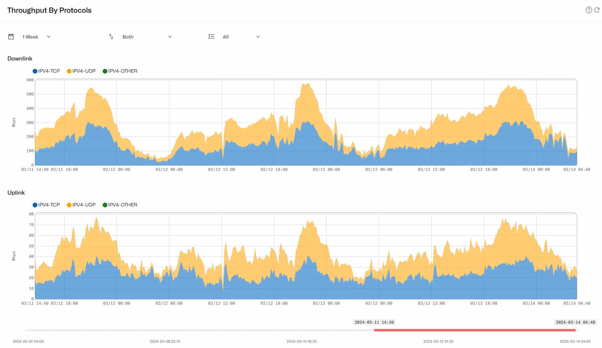
Statistics->Throughput->Overview shows the temporal evolution of total traffic throughput, adding both directions and all wires.

Statistics->Throughput->Protocols shows the temporal evolution of traffic throughput, broken down by:
- Direction: downlink (DN) and uplink (UP).
- IP version: IPV4, IPV6 or No IP.
- L4 Protocol type: TCP, UDP or Other IP protocol.
- Bypass traffic.
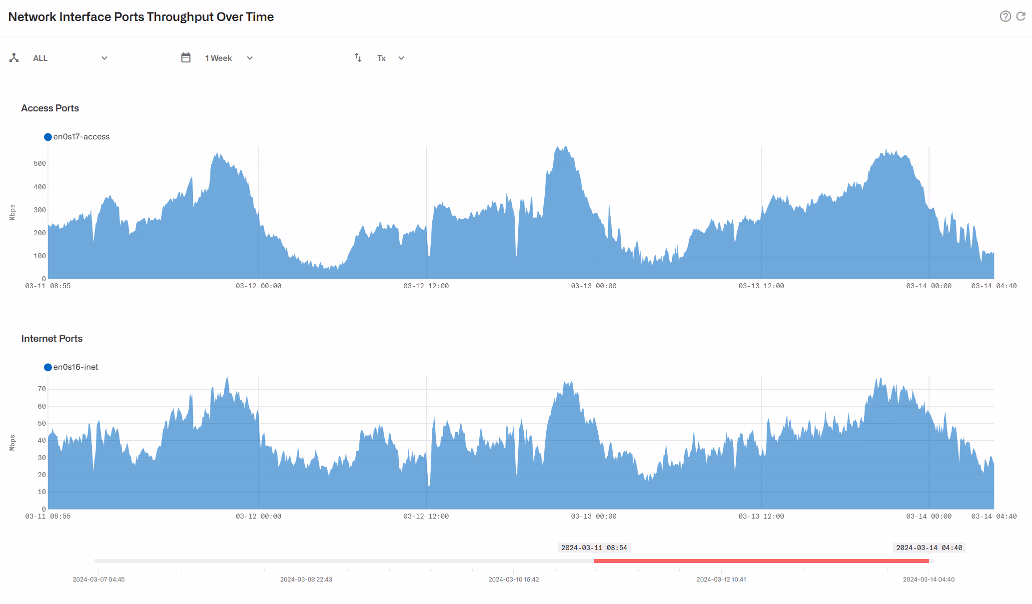
The evolution over time per network interface is available in Statistics->Throughput->Interfaces.
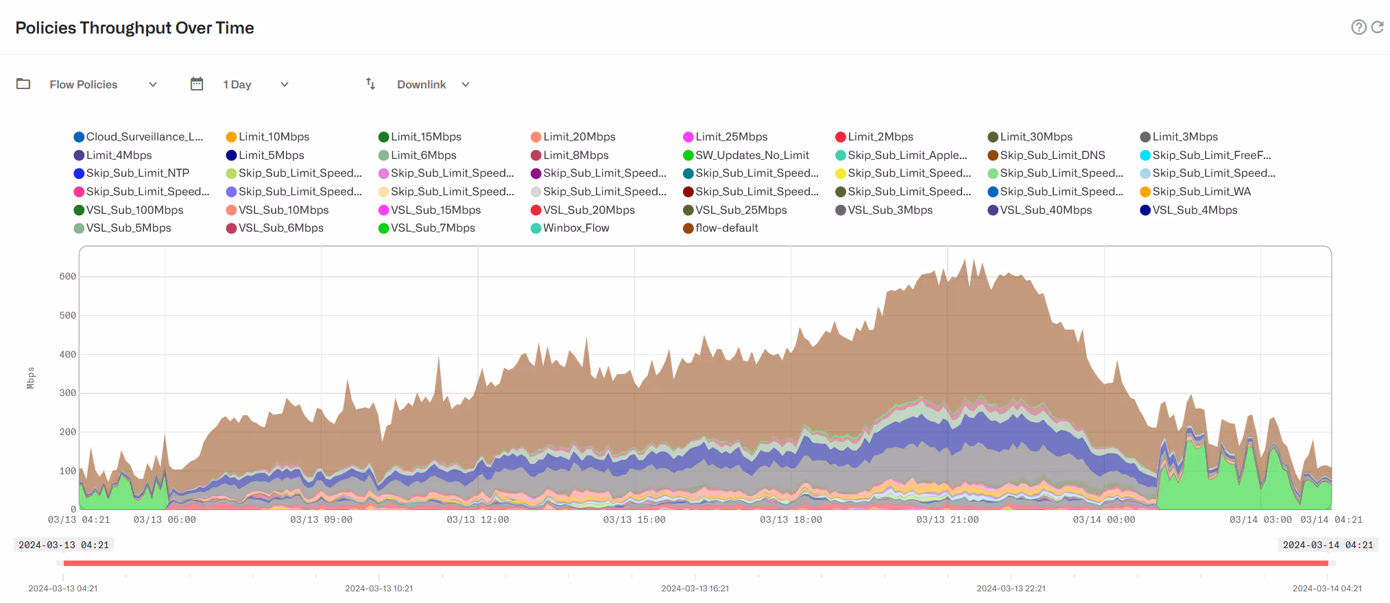
It is possible to check how much traffic is being processed according to each of the configured policies. For Subscriber Flows policies, it can be checked in Statistics->Throughput->Subscriber Flows Policies and similarly for Subscriber Rate Policies and Subscriber Monitoring Policies.
Latencies
The chart in Statistics->System->Latencies shows the access RTT ( i.e. the round-trip time between the BQN server and the subscribers over the access network). Access RTT is also known as downlink latency.

Latency samples are calculated for all active flows (those carrying data) every second. Those samples are grouped in five-minute intervals to generate a latency value for that period. Based on those latency samples, three values are provided:
- Mean-Min: for each flow, we take the minimum latency sample over the five-minute interval and we calculate the average across all flows.
- P50-Median: we take the median value (the percentile 50) of the llatency samples, i.e. the latency that separates the lower half from the higher half of values. For example, if the median is 2.5 ms, half the latencies are 2.5 ms or less.
- P80-80thpercentile: we take the 80th percentile, i.e., the value that is higher than 80% of the samples (and lower than the higher 20%). For example, if the p80 is 5 ms, 80% of the latencies are 5 ms or less.
Retransmissions
Also, Statistics->System->Retransmissions shows the average retransmission percentage in the access network:

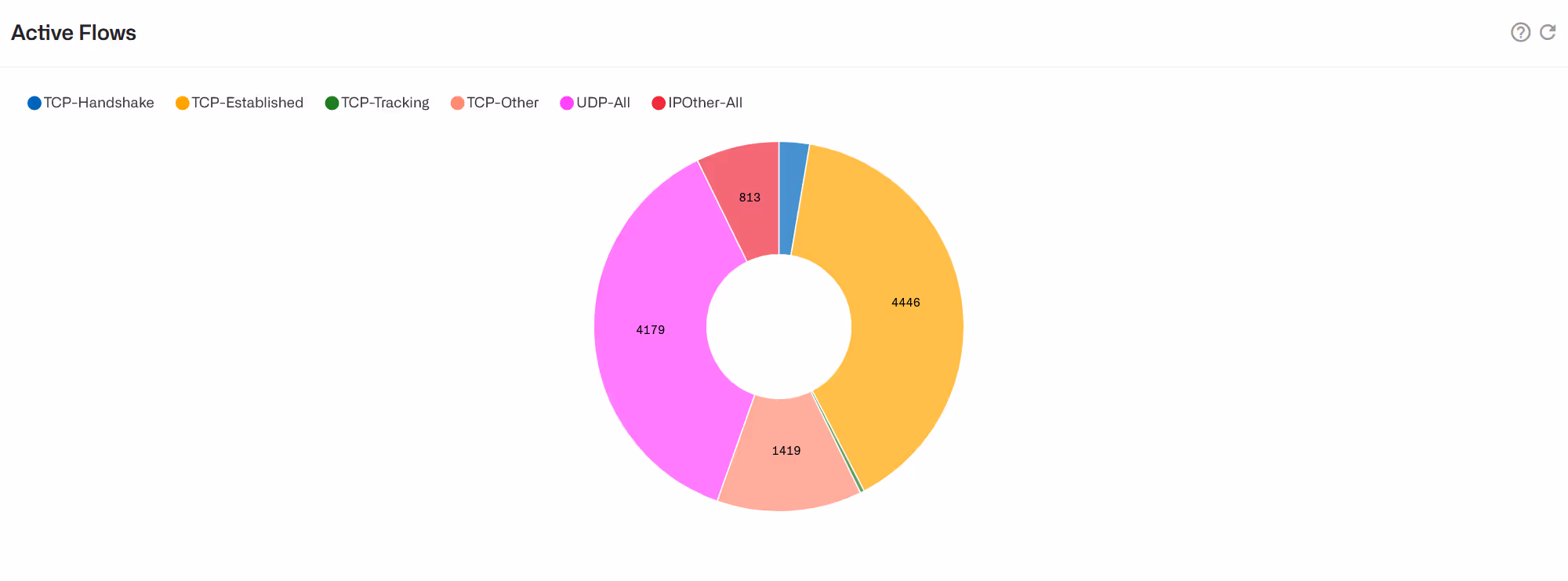
Flows
To see the number of flows per policy and per protocol, click on Statistics->Flow->Per Policy and Statistics->Flow->Per Protocol respectively.

You can also see the instantaneous number of Flows per protocol in Status->Flows->Per Protocol and per subscriber in Status->Flows->Per Subscriber.
Live Throughput of Main Subscribers
Go to Status->Subscribers->Live Throughput to see in real time the throughput of the biggest subscribers by volume usage:
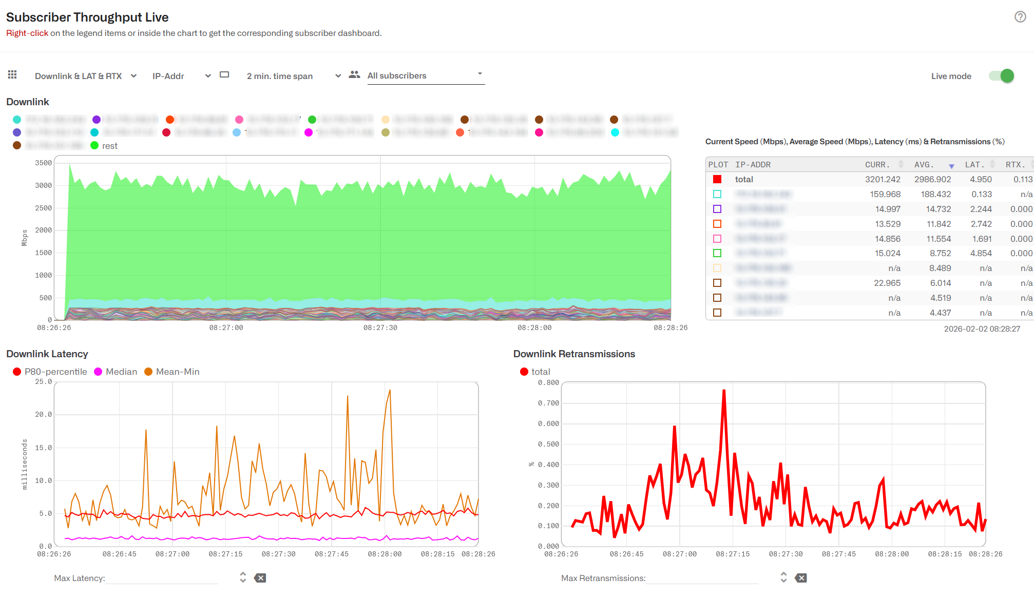
Subscribers are shown by IP address (default) or by subscriber Id. Use the selector on the top left to choose which one to use.
A table on the right-hand side shows the average and current speeds of the main subscribers.
At the button, you can see the network latency and retransmissions along with those subscribers selected on the table.
For latencies, we show the mean of mins, the median and the percentile 80th.
Set Live mode toggle off to stop the live chart.
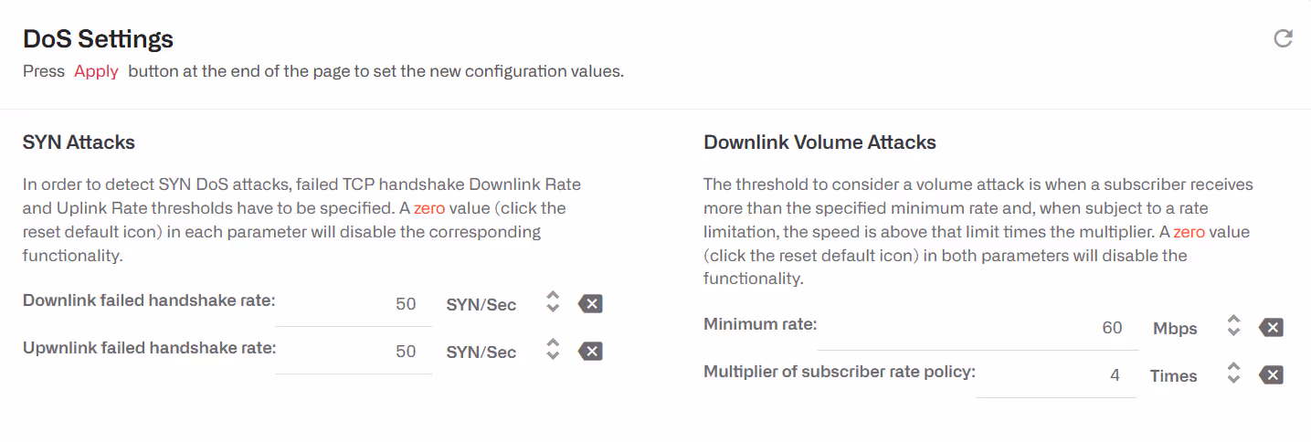
DoS
The BQN detects Denial of Service attacks. To do this, DoS thresholds must be configured in Configuration->DoS:
- Downlink failed handshake rate. SYNs per second without an answer in the direction towards the subscribers (initialized from the Internet). A typical value is 50.
- Uplink failed handshake rate. SYNs per second without an answer initialized by a subscriber. A typical value is 50.
- Minimum rate. Minimum speed rate that can be considered a volumetric attack. The exact value depends on the network speed, but a typical value is 50 Mbps.
- Multiplier of subscriber rate policy. If the subscriber has a known rate policy, a threshold is defined as multiplier *downlink limit. A typical multiplier is 3. For example, a subscriber with a 20Mbps plan will have a DoS threshold of 3*20=60Mbps.
The DoS events are shown in Statistics->DoS Attacks. In DoS Attacks Over Time, the DoS attack events are displayed showing its type, its duration and parameters such as the affected subscriber IP and the main IP contributing to the attack.

In Details of DoS Attacks all DoS events are listed, with information about the time, event type, IP address affected, the direction of the attack (ingress or egress) and its duration. In SYN Attacks can be found attacks of SYN type, with the number of failed SYN and its rate per second. In Volume Attacks there is a list of volumetric attacks, with information of the traffic volume and its average rate.
Subscriber Group QoE Metrics
To see metrics per subscriber group, go to Status->Subscribers->Subscriber Groups (also accessible from Statistics->Subscribers->Subscriber Groups).
The following metrics charts are available:
- Average speed
- Active flows
- Active subscribers
- Flows created per minute
- Latency-P80: percentile 80th ofaccess latency.
- Latency-Median: median value of access latency.
- Latency-Mean-Min: average of minimum accesslatency values.
- Retransmissions
- Percentage of traffic with congestion
Average Speed is selected by default
On the top of the page, there are a few selectors affecting the,information shown:
- Metric direction (downlink or uplink). For example,downlink latency is the latency on the access network and uplink latency, the latency on the Internet side.
- IP address filter: you can enter one specific IP address (v4 or v6) or an IP address range (using /mask) to show only groups that addresses are a member.
- Group Type filter: selects groups by type (e.g. dual-stack).
- MEAN-Mbps warning threshold: this field isrelated to warning thresholds and will be explained there.
- A time interval selector: shows last 24 hours(default), up to 3 months.
- Metric selector: the metrics to show. Averagespeed is the one selected by default.
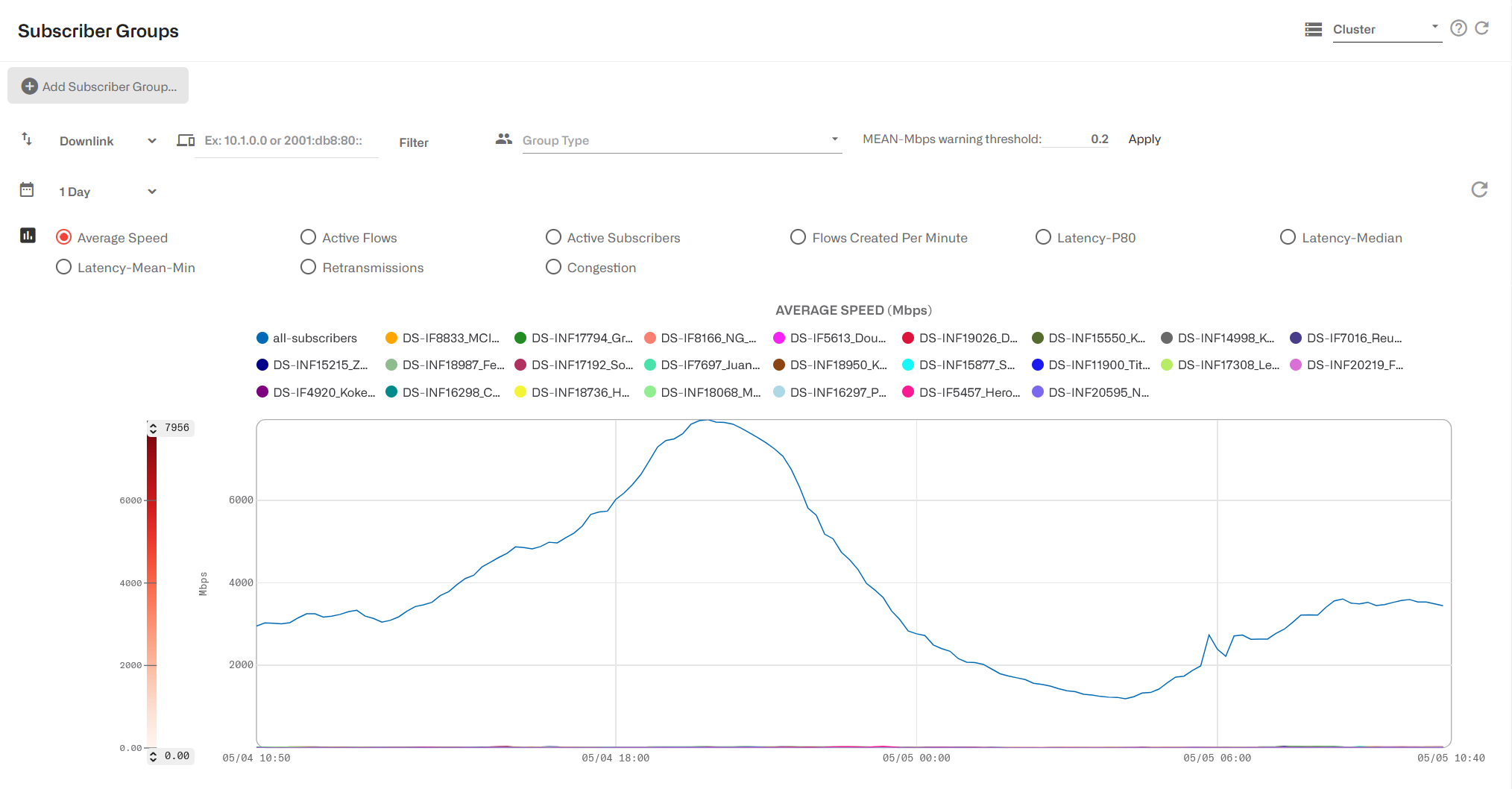
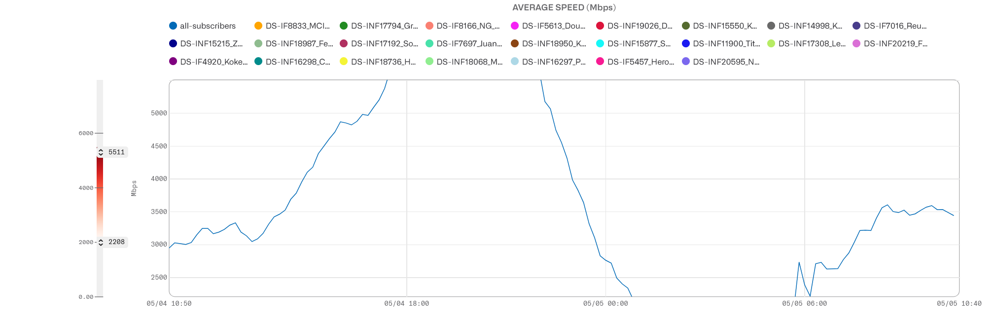
Time evolution of the selected metric is shown as a line chart.
Right-clicking on a group of the chart legend will lead to that group’s dashboard.
The visible value range can be adjusted dragging the maximum and minimum values to the left of the chart:
Heatmaps and Box Plots
To facilitate the analysis of the metrics, we show them also as heatmaps and as box plots.
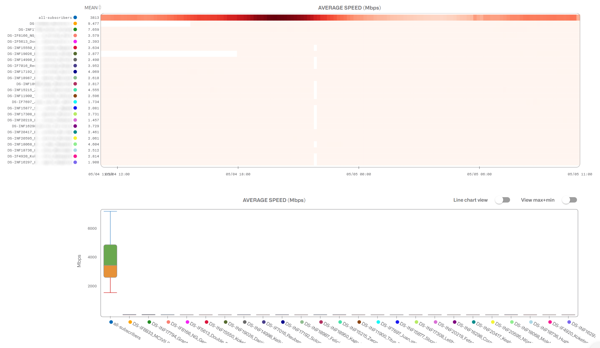
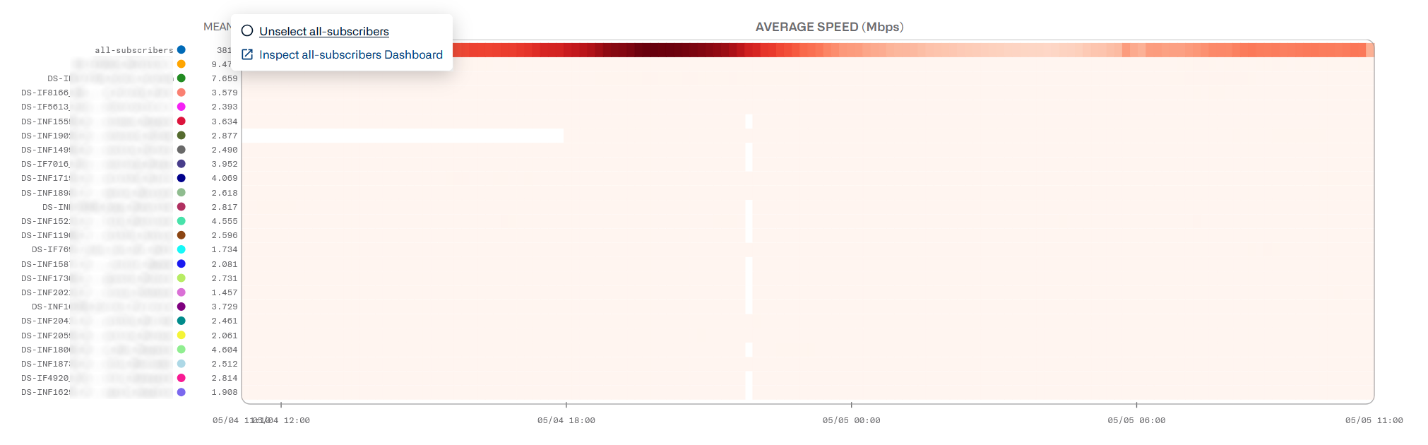
The heatmap represents a scale of color intensity that maps the metric range. This is shown with a color scale to the left of the metric chart. The higher the number, the higher the color intensity. Each group has a row with the evolution of the metric over time. Click on the row to unselect that group or to go to the group dashboard.
A MEAN column on the left of the heatmap shows the average value of the metric, for each group, during the selected period of time. The groups can be sorted by that average value in ascending or descending order.
The color scale is adjustable. Dragging the minimum and maximum values in the time evolution chart will focus the color range to that metric interval, leaving values below and above painted in the lighter and darker colors respectively. This helps to focus the analysis, zooming into that metric interval. The MEAN value will be adjusted to the selected interval, with values outside the range rounded to the interval limits.
Placing the mouse over a heatmap cell shows its exact timeand value.
In the box plot, one can see the distribution of metrics for each group during that period. You can add the minimum and maximum values and also, to facilitate comparisons between groups, change from box plot to line charts.
Overall QoE Box Plots
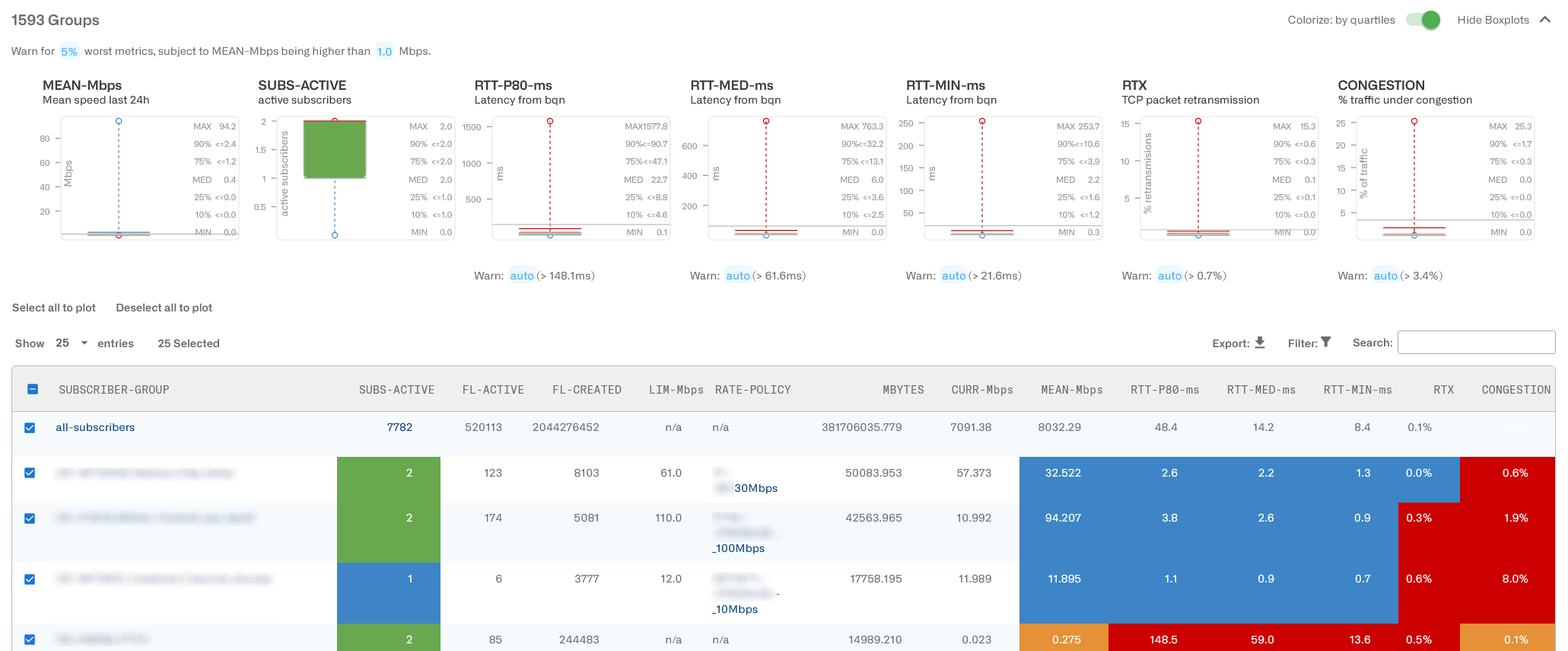
Five box plot charts summarize the distribution of the following key metrics across all the groups:
- MEAN-Mbps: average speed in Mbps.
- SUBS-ACTIVE: number of active subscribers in the group.
- RTT-P80-ms: percentile 80th of latency in milliseconds (p80 is the value higher than 80% of the obtained measurements).
- RTT-MED-ms: median latency in milliseconds.
- RTT-MIN-ms: mean of minimum values of the latency in milliseconds (RTT-ms in previous releases).
- RTX: packet loss rate in percentage.
- CONGESTION: percentage of the traffic suffering congestion.
Each box plot shows the maximum and minimum values as well as intermediate percentiles, median included (MED).
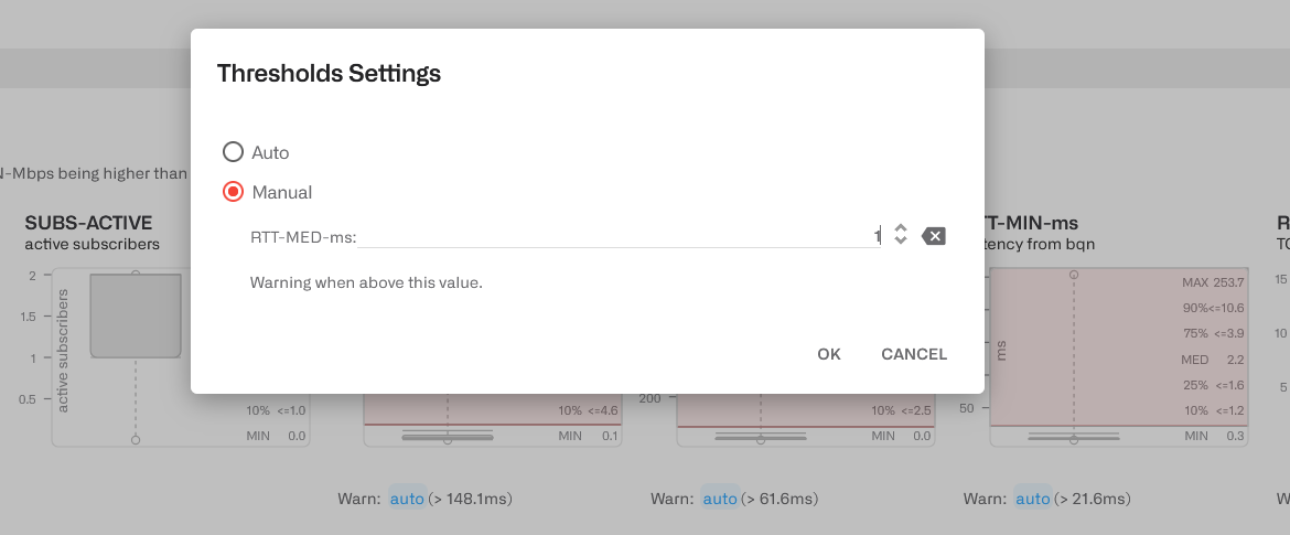
A configurable threshold helps to identify metrics so high that may lead to customer quality of experience issues.
By default, the threshold is calculated automatically as the percentile 95th or, in other words, a threshold exceeded by 5% of the measurements. You can change it by clicking on the blue 5% label. To avoid highlighting groups with very low activity, where metrics are not representative,only those with a mean speed about 1 Mbps are highlighted. This can also be changed, but normally it is not necessary. In the example, we have at the top: Warn for 5% worst metrics, subject to MEAN-Mbps being higher than 1.0 Mbps.
In the example above, the RTx threshold has been setautomatically to 0.7%, the box plot will shade in red all values between 0.7%and the maximum.
You can set any threshold to a specific value. Click on thethreshold blue label and use the dialogue.
MEAN-Mbps and SUBS-ACTIVE have no warning thresholds (no relationship between those metric and QoE).
Instead of highlighting in red the values above the warning threshold, it is possible to highlight four quartiles by color. Set the switch Colorize in the upper right.
The coloring is as follows:
· 1st quartile (lower 25% of values) :blue.
· 2nd quartile (above 1st quartile up to median): green.
· 3rd quartile (above median up to 4th quartile): orange.
· 4th quartile (higher 25% of values): red
Please note that, except for MEAN-Mbps, the convention ist he opposite to other box plots (1st quartile in blue, 4thquartile in red), because for QoE metrics, the lower the value the better (lower latency or rtx for example).
Subscriber Group Table
A table contains detailed information about all subscriber groups.
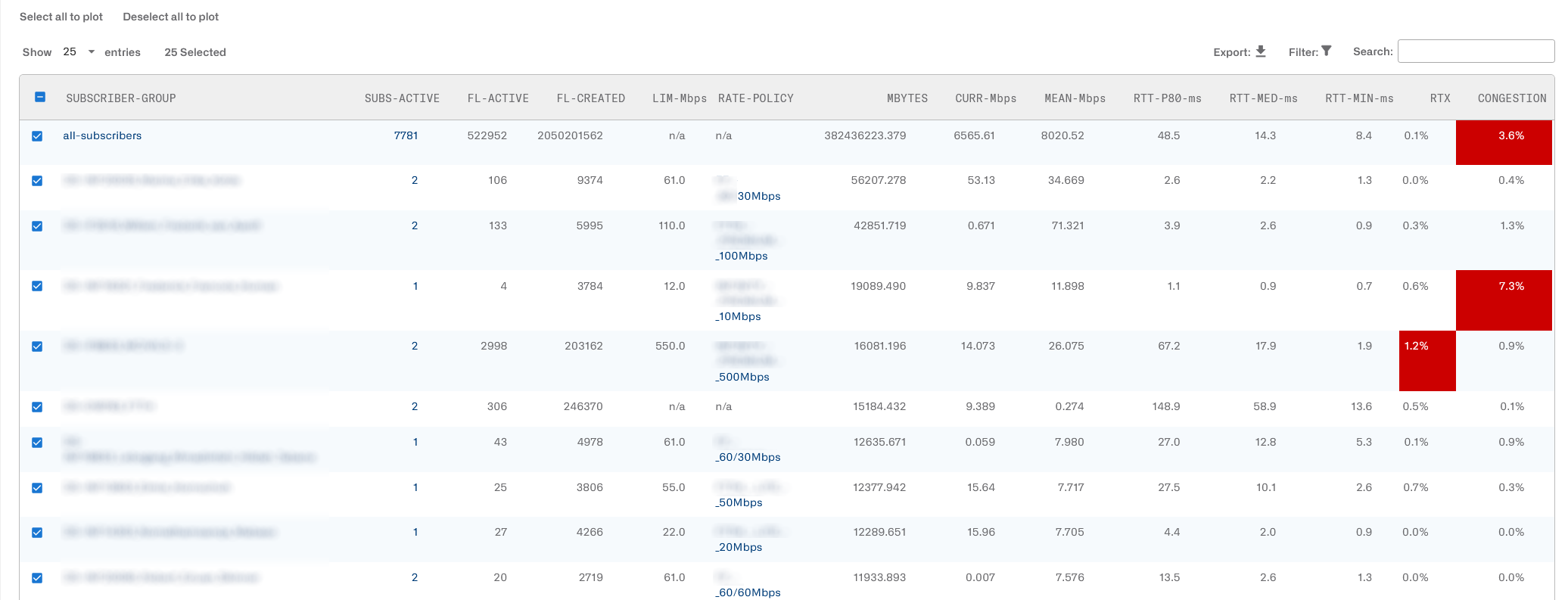
The information provided on the table is as follows:
- SUBSCRIBER-GROUP: the subscriber group name.Cl icking on the name leads to the group dashboard.
- SUBS-ACTIVE: counts the number of subscribers members of that group that have an active session in the BQN server. Clicking on itleads to the Subscriber QoE page filtered by this subscriber group, so the metrics of each individual group member metrics can be checked there.
- FL-ACTIVE: number of active flows part of this group traffic.
- FL-CREATED: flows created so far belonging to this subscriber group.
- LIM-Mbps: speed rate limit set in that direction, in Mbps (n/a if no limit set).
- RATE-POLICY: name of the rate policy being applied to this group (n/a if no policy set). The policy definition is the one setting the limit shown in LIM-Mbps.
- MBYTES: total traffic volume of this subscriber group so far, in megabytes.
- CURR-Mbps: current speed in Mbps.
- MEAN-Mbps: moving average speed in Mbps (calculated every 10 minutes).
- RTT-P80-ms: percentile 80th of latencyin milliseconds (p80 is the value higher than 80% of the obtained measurements). If the downlink direction is selected, the latency shown is on the access side (towards the subscribers). If uplink direction is selected, the latency on the Internet side is shown.
- RTT-MED-ms: median latency in milliseconds.
- RTT-MIN-ms: mean of minimum values of the latency in milliseconds (RTT-ms in previous releases).
- RTX: the moving average of percentage of TCP retransmissions (directly related to packet losses). If the downlink direction is selected, the retransmission shown is on the access side (towards the subscribers). If uplink direction is selected, the retransmission is on the Internet side is shown.
- CONGESTION: moving average of the percentage of traffic suffering congestion.
- LIFETIME: duration so far of this subscriber group.
- GROUP-TYPE: typeof group. Examples: site, access-point, dual-stack, etc.
- ACTIONS: edit group, remove group or go to live traffic page filtered by this subscriber group.
- Last column: tick this box if you want this subscriber metrics to be show in the charts.
A click on the group name leads to the group dashboard.
The table can be sorted by any column by clicking onit, for example, click on RTT-ms to show groups with the biggest latency first.
You can use filters to select groups meeting some elaborate criteria, like having latencies within a range (see Table Column Filters formore details). The Search box can also be used to select rows matching a value in any column. Groups filtered in the table will be reflected in the rest of the page charts.
It is possible to Export the table content to a CSV file.
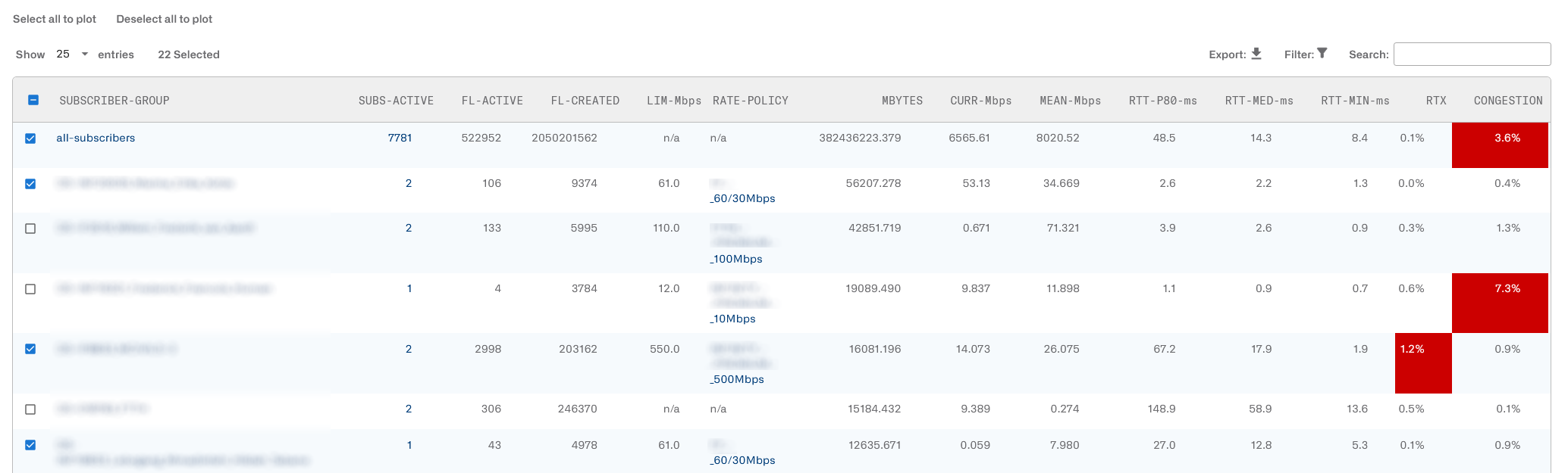
You can plot the default first 25 groups or unplot them clicking on the Select all to plot and Deselect all to plot buttons respectively.
You can also plot individual groups, up to a maximum of 50, selecting their plot tick box in the firsr column of the table and waiting a few seconds. Unselecting the plot tick will remove that group from the chart.
In the table, the values above the warning threshold will be shaded in red, so the affected groups can be identified easily.
To avoid highlighting groups that are simply inactive, a threshold is applied to the mean speed (MEAN-Mbps warning threshold, on the top of the page). If a group does not reach at least this mean speed, it won’t get a warning score and won’t be highlighted. The threshold can be changed, but in general this is not needed.
If you have reached the group QoE metrics page from a subscriber dashboard (clicking on View subscriber groups in the subscriber dashboard), the subscriber metrics will be shown along with the metrics of the groups of which it is a member:
Subscriber Group Dashboard
Clicking a subscriber group name in the subscriber group QoE page will show a subscriber group dashboard.
To see the detailed metrics of each group member, click on See main subscriber in group to go to the Subscriber QoE metrics page filtered by this subscriber group.
To see the subscriber group definition and/or make changes to it, click on Edit subscriber group.
The dashboad shows the time evolution over the selected period of the following subscriber group metrics:
- Downlink and uplink average speeds.
- Created flows and active flows.
- Group access latencies (average of minimum values, median and percentile 80th).
- Group average access retransmission and networkaccess retransmissions.
- Percentage of traffic suffering congestion.
- Active subscriber members over time.
It also containsscatter-plots with the relationship between the average speed and measurements of latency, retransmission and congestion. A red line shows the possible correlation between the two. These charts help to identify speeds where other QoE metrics may deteriorate (and perhaps mitigate it by limiting the overall speed of that group).
If you place the mouse on top of a chart point, a tooltip will display its exact value. Tootips in the other charts at the same point in time will show the other metrics values.
The dashboard also contains a chart with the time evolution of DPI services of the group.

The distributions of application speed and latencies are shown, along with their time evolution.

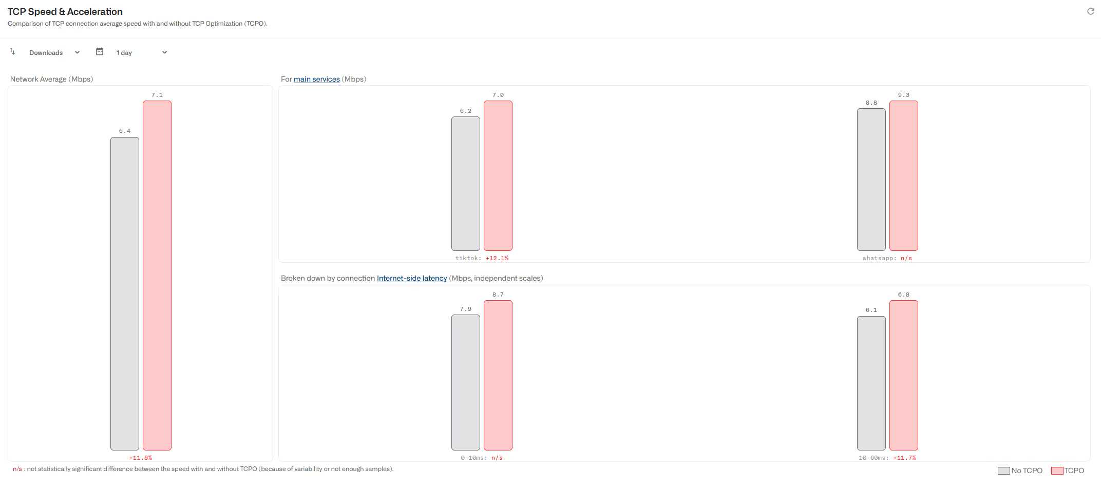
Finally, TCP optimization metrics are provided.
If the metrics go over the warning threshold valuesconfigured in the QoE metrics page, the chart area is highlighted. Charts with the warning highlight are: mean-min latency over time, retransmissions over time, congestion over time, mean-min latency vs speed, retransmission vs speed and congestion vs speed. The following screenshot shows an example:
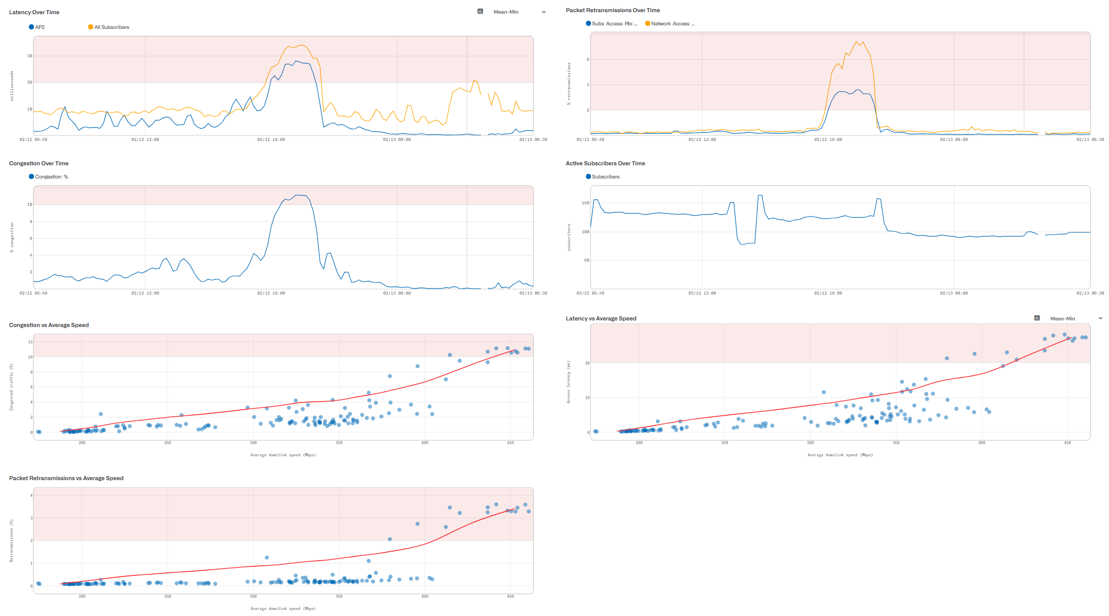
To hide the highlight, disable the switch Colorize warning threshold.
Subscriber Group Live Mode
In the subscriber group dashboard, there is a Live mode icon to monitor a subscriber group mode closely. Click on it and a page will appear with the evolution of the speeds of the main members ofthe group and some extra information.
A filter at the top of thepage selects the information to show:
- Downlink & Uplink: downlink and uplink average speed.
- Downlink & LAT & RTX: downlink speeds and group average latency and retransmission.
- Uplink & LAT & RTX: uplink speeds and group average latency and retransmission.
It is possible to identifymembers by IP or subscriber ID.
A maximum time span can be shown (latest number of minutes). This is configurable to 2, 5 or 10 minutes. When the timespan is reached, e.g. after 5 minutes, the charts will continue being updated, showing the latest five minutes window.
A group name selector canchange the live mode view to another group. You can type in parts of the groupname to locate it easier in the selector.
Exporting DPI Records
The Bequant BQN product generates DPI information for the traffic passing through it, allowing identification of the composition of that traffic in terms of services and applications. The information is viewable in the graphical interface of the BQN product. To facilitate exporting this information for processing by external reporting systems, this document describes the BQN shell command that enables it. The command described here is available starting from version R4.21.3.
Command Syntax
Example:
DPI records of the 14th of Abril, 2024:
Output format
The command returns one line per record, with the fields ofeach record separated by the chosen character. For example:
The first line is the header. The fields are as follows:
When ; or , are used as separators, SUBSCRIBER-ID, DOMAIN and DPI fields are enclosed between double quotes. Double quotes inside any of those fields are escaped with double quotes (" is ""), following RFC4180 recommendation.
Invocation
The command is invoked from the BQN shell (not from the Linux shell of the BQN server). A user of operator profile is enough. For example:
The command can be invoked remotely using ssh:
And also redirect the output to a local file:
It is recommended to query once a day, at times of low traffic:
Importing
The files generated by the output of the described commandare directly importable by tools that accept the CSV standard (for example, MSExcel).
All records are marked with their date and time of generation and adhere to the requested period, but it is not guaranteed that they will be returned in date order (the reason being that the information is obtained from various sources, which can alter the order). Therefore, if you want to perform a temporal analysis within the requested period, the records should be sorted by date once imported into the reporting tool.
Lorem ipsum dolor sit amet, consectetur adipiscing elit. Suspendisse varius enim in eros elementum tristique. Duis cursus, mi quis viverra ornare, eros dolor interdum nulla, ut commodo diam libero vitae erat. Aenean faucibus nibh et justo cursus id rutrum lorem imperdiet. Nunc ut sem vitae risus tristique posuere.
Lorem ipsum dolor sit amet, consectetur adipiscing elit. Suspendisse varius enim in eros elementum tristique. Duis cursus, mi quis viverra ornare, eros dolor interdum nulla, ut commodo diam libero vitae erat. Aenean faucibus nibh et justo cursus id rutrum lorem imperdiet. Nunc ut sem vitae risus tristique posuere.
Lorem ipsum dolor sit amet, consectetur adipiscing elit. Suspendisse varius enim in eros elementum tristique. Duis cursus, mi quis viverra ornare, eros dolor interdum nulla, ut commodo diam libero vitae erat. Aenean faucibus nibh et justo cursus id rutrum lorem imperdiet. Nunc ut sem vitae risus tristique posuere.